
Sensational romance novel covers are always worth celebrating.
Whether you prefer your cover art to be shirtless and sexy, loveably goofy, or charming enough to invite to your grandmother’s Thanksgiving dinner, we have cover designs that will make you fall head over heels. Is love at first sight real? We certainly think so!
Why is Cover Design So Important for Romance Novels
- Romance novels equate to at least a third of all book sales each year.
- Romantic fiction generates over a billion dollars of revenue each year.
- While the stereotype is that all romance readers are middle-aged women with hoards of angry cats and eharmony accounts, statistics show that most romance readers are women between the ages of 18-46.
Even though the romance book market is highly successful, it is also more competitive than getting reservations at your favorite restaurant on Valentine’s day. Having a professionally designed romance novel cover can give your book a leg-up regardless of how you choose to publish.
Speaking of professional cover design, several of the romance book covers that we will talk about in this article were created here at Ebook Launch. If you like our work, please contact us for more information.
How Do I Choose the Right Romance Novel Cover Design?
A successful book cover design should be:
- True to your vision
- Reader-friendly
- Tailored to the specific genre or subgenre that you are writing in
Content plays a huge role in influencing cover design. For example, you wouldn’t want your goofy, lighthearted, funny romance novel to feature a blood-red dust jacket, formal cursive font styling, and two characters locked in an erotic embrace on the front cover. Frankly, we aren’t even sure how to react to that—it’s awkward.
Specific color schemes, visual cues, and font styles give readers hints to help them decide if your romance novel matches their reading preferences. Think of famous romance novel covers like The Notebook, Outlander, and The Princess Bride—all of which later became crowd-pleasing movies or TV shows.
Below are 30 romance novel covers broken down into ten unique subcategories. We’ll examine each book cover and discuss why it attracts readers.
- Contemporary Romance
- Historical Romance
- Speculative Romance
- Funny Romance
- Erotic Romance
- Paranormal Romance
- Suspense Romance
- Holiday Romance
- Inspirational Romance
- Young Adult Romance
Contemporary Romance
Contemporary romance novels (also called modern romance) make up the largest subcategory of romantic fiction. While most contemporary romance novels take place in the smartphone era, anything that’s happened since World War II is fair game.
These 21st-century romance stories feature female characters balancing relationships with careers, family expectations, and past traumatic events. Contemporary romance is on the front lines when it comes to telling stories about LGBTQ, interracial, or neurodivergent characters navigating intimate relationships.
Color Scheme: Contemporary romance books can work in a variety of colors. Some books have bright, happy hues. Others prefer traditional colors like scarlet, navy blue, and black with lighter-toned title fonts.
Font Style: Almost all contemporary romance novels have chosen to embrace large, confident, capitalized font styles. The title is a declaration to the reader that shouts, “Read me! I am spectacular!”
Imagery: Simple images go a long way with contemporary romance novel covers. Readers should get a sense of significant plot points, emotions, or locations by looking at the book’s cover art.
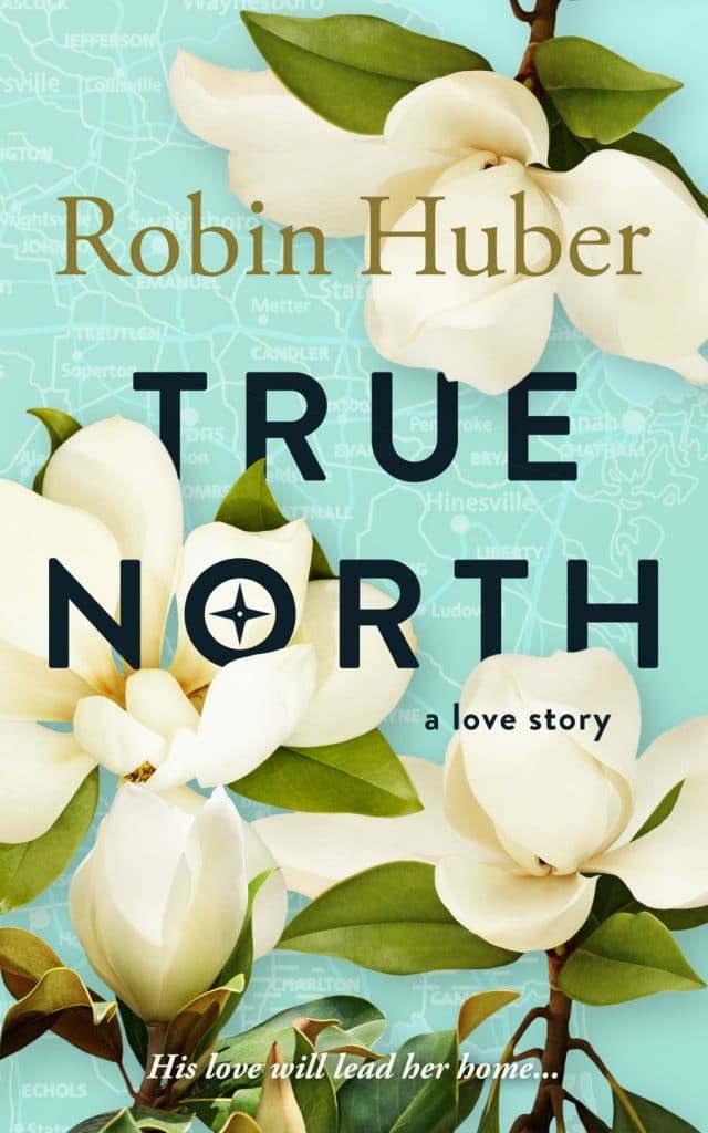
1. True North
Robin Huber’s bright and cozy cover art is perfect for a modern, southern romance story.
The title font is bold and empowering without conquering the page. Instead, all the information you need is neatly folded into the petals of the magnolia blossoms. The mix of eye-catching dark and light colors practically pop off the front of this contemporary romance novel cover.
Ebook Launch created this cover.
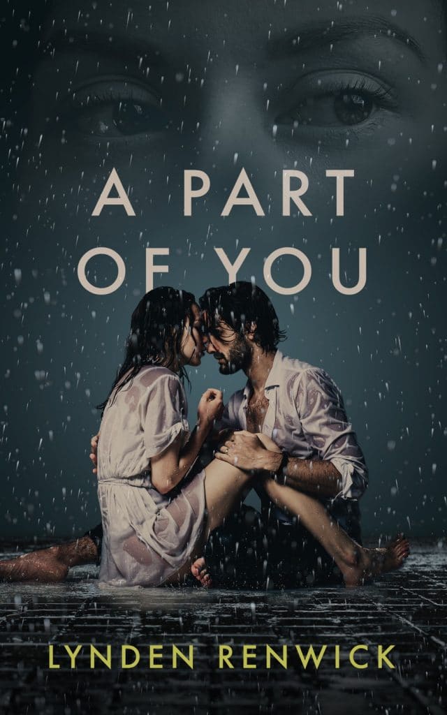
2. A Part of You
A Part of You has a dramatic book cover design that emphasizes the intense emotions that characters are dealing with together.
The cream colors and the darker blue-black tones are doing the heavy lifting here as they maintain a balance between hope and despair. Imagine how different this book cover would look if the characters were both wearing seductive shades of pink and red. Changing the color scheme would likely lead readers to question if this was an erotic novel or romantic thriller rather than a contemporary, second-chance love story.
Ebook Launch created this cover.
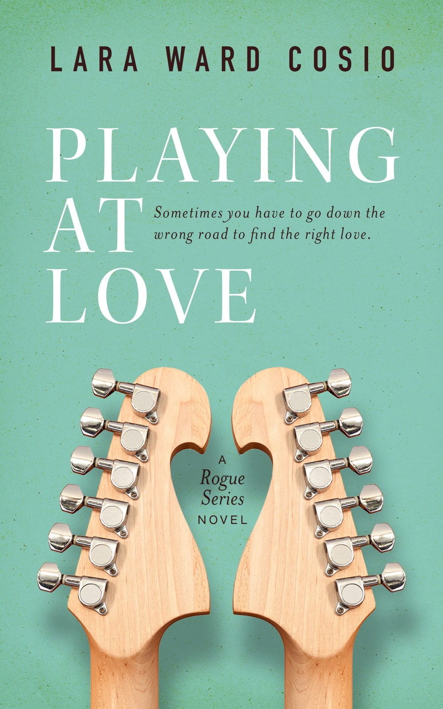
3. Playing at Love
Lara Ward Cosio’s easygoing, happy-go-lucky cover design invites readers to dive into her world of drama, love, and rockstars.
Right away, we know that music will either bring characters together or try to tear them apart in this contemporary romance tale. The playful color green used on this cover symbolizes hope, prosperity, and growth. Colors found in nature—sage, seafoam, and sky blue—are calming. Readers looking for lighthearted love stories are drawn to these color schemes.
Ebook Launch created this cover.
Historical Romance
We’re talking about the handsome rogue, the belle of the victorian ball, and the brawny pirate with a heart of gold. Historical romance is the broadest subgenre since it allows writers to tackle an impressive variety of periods and places across the globe.
While the stereotype is that romantic historical fiction focuses on the plights of women wearing too-tight corsets, trapped in a patriarchal world, the reality couldn’t be further from the truth! The majority of historical romance writers are women telling stories about strong, resilient characters regardless of race or social class.
Color Scheme: Color can convey the gravity of a situation. In historical romances, the stakes are high! Characters can be fighting for both their love lives and their literal lives. Dark shading or dramatic shifts between dark and light coloring is an effective way to make these book covers stand out.
Font Style: Historical Romance books can have creative fonts and scriptures integrated into their designs. The typography used on the book’s cover can be reminiscent of a lover’s handwriting. You can even add a wax seal if that’s appropriate.
Imagery: Imagery should reflect the time and place in which the majority of your story unfolds. It’s essential to get this right. Otherwise, you risk misleading readers and losing credibility as an author. You can create a gorgeous (historically accurate!) cover through a combination of landscape and character imagery. It can be fun to play dress-up with your characters and choose what they will—or won’t—wear when they make their big debut.
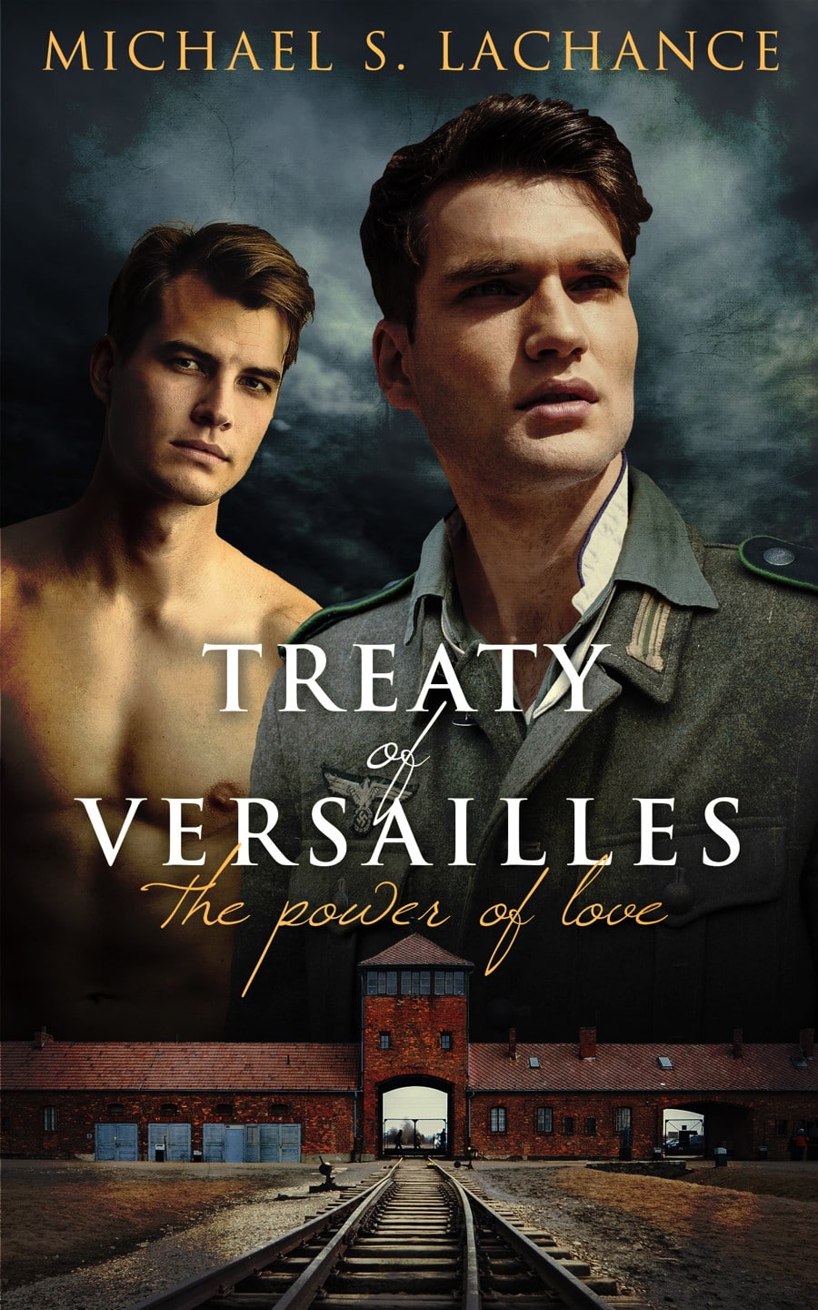
4. Treaty of Versailles: The Power of Love
What’s not to love about this dramatic World War I cover design?
Treaty of Versailles: The Power of Love by Michael S. Lachance is a prime example of the power of contrast. We have a bright white title against a shadowy, mysterious background that creates intrigue. The cursive subtitle works similarly to create contrast with the main title. We get to see a little bit of location with the train station, and the cover includes two intense images of the main character. Which one do you like better, with or without the uniform? I know which one we prefer ;).
Ebook Launch created this cover.
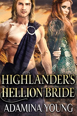
5. Highlander’s Hellion Bride
Adamina Young’s striking cover design here is a feast for the eyes. Most people would assume that the color yellow symbolizes friendship and trust. Historically though, pale yellow has represented jealousy and emotional turmoil. This cover gives readers visual access to the main characters right away. The large, commanding font conveys a sense of urgency.
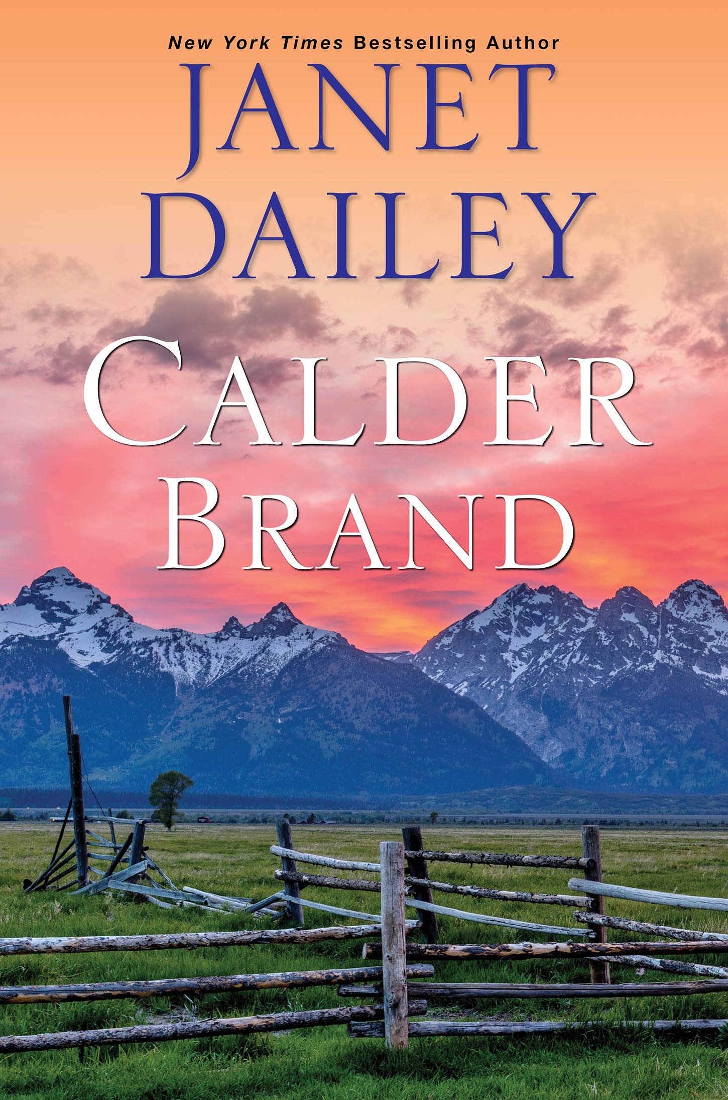
6. Calder Brand
Romance aficionados might recognize Janet Dailey’s best-selling Calder Brand and its spectacular cover design.
This instant classic cover design features a fantastic view of the American Western frontier. The color scheme is full of promise and danger. The images of the mountains are both beautiful and potentially deadly. The fence line is in disrepair; why? You’ll have to read and find out! This cover sets the scene and creates a place for romance readers to escape to that promises a swoon-worthy adventure is waiting for them.
Speculative Romance
The six-mooned sky is the limit when it comes to speculative romance book cover design. Speculative literature includes fantasy, science fiction, and anything in between (we’ll talk about paranormal romance later). Note: if fantasy is your genre, don’t miss our post about 25 amazing fantasy book cover designs and why they work.
Speculative romance appeals to readers who want to explore new or parallel worlds with love dynamics similar to ours. Maybe aliens have terrible Tinder dates too?
Color Scheme: Colors that pop off the page are paramount in this popular subgenre. You want your book to leap off the shelf (or amazon page), and there’s a lot of competition. A professional designer can help you create a cover that readers can’t help but snap a picture of, or better yet, buy the book.
Font Style: A successful font style helps readers pinpoint which subgenre best fits your book. Fantasy romance novels use more swirling, angelic fonts. Science-fiction romance is more likely to use rigid lettering and flashy, bright-colored typography.
Imagery: Speculative romance novels center on the love dynamics between characters within magical or futuristic worlds. To emphasize the focus on the characters, put them on your front cover! This works to separate your novel from speculative fiction books without romantic components.
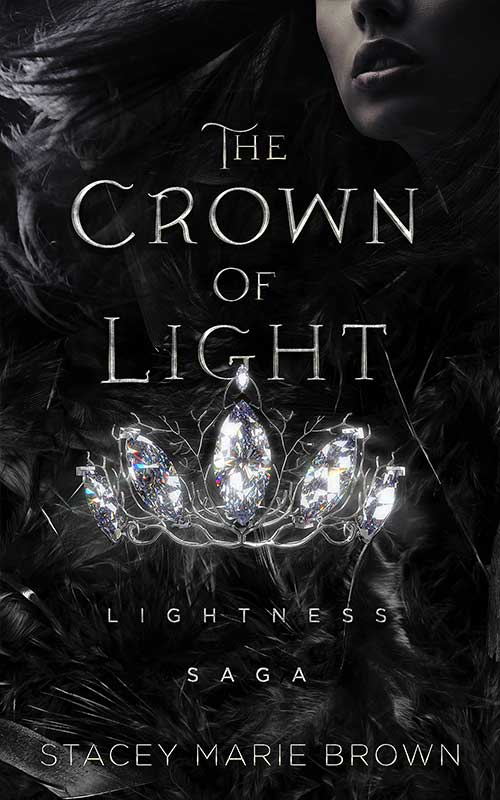
7. The Crown of Light
The Crown of Light sets itself up as a fantasy-romance hybrid through its strategic use of images.
The bright diamonds on the center of the page invite readers to look closely at the entire cover. As they explore, readers peel back the layers of imagery at work here, including the woman’s face and the mysterious detailing in the corners of the pages. Chances are, if you’ve spent this long looking at the cover art, you’re willing to pick up the book and read the back summary. Next thing you know, you’re edging readers towards buying your book!
Ebook Launch created this cover.
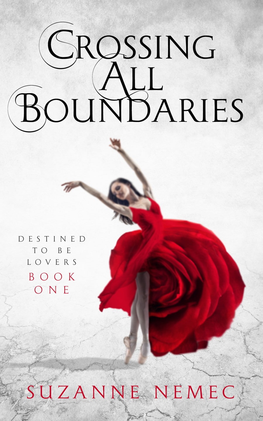
8. Crossing All Boundaries
Fantasy readers love to find familiar elements in strange or fantastical settings. Crossing all Boundaries by Suzanne Nemec is equal measures easy to understand and intriguing mystery.
This romance novel cover is reminiscent of a fairy tale all-grown-up. The vibrant rose-shaped dress rewards potential readers with familiar symbolism and pairs nicely with the spellbinding title font. This cover could easily be adapted as part of a series.
Ebook Launch created this cover.
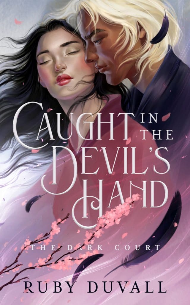
9. Caught in the Devil’s Hand
Gorgeous illustrated covers like this one are hard to beat and is one of our favorite fantasy book covers!
The handsome images and soft colors work together to create a novel cover that’s bound to make any hopeless romantic’s heart flutter. The swirling cherry blossom petals and gentle feathers add a sense of magical delight to this design, and the font implores us to wonder, is being caught by the devil really a bad thing? Maybe not!
Ebook Launch created this cover.
Paranormal Romance
Paranormal Romance is a thriving niche within the romance genre that has an intensely loyal and dedicated following. Titles like Twilight, A Hunger Like No Other, City of Bones, and Evermore have smashed publishing records and drummed up buzz about the subgenre. This past year was full of sexy, fun, and downright devilish paranormal romance success stories.
But designing a successful paranormal romance is a delicate balance. Visually blending supernatural elements with details from our world has to be done so that readers can quickly grasp important contextual details without killing the suspense.
Color Scheme: Colors should represent major themes or popular ideas in your novel. If you’re talking about sexy vampires, your cover will likely include red, black, or white colors. Maybe some purple if your vampires like to sparkle. Mundane elements of your cover can be toned down to focus on what’s unique about your book.
Font Style: Typography conveys tone in paranormal romance novels. If your book engages more serious, world-ending/altering issues, your font style should let readers know that the stakes are high. A more playful font empathizes a less severe plot. It allows your readers to relax into your story rather than be held hostage by it.
Imagery: You have a plethora of options when it comes to paranormal romance imagery. Will you choose something symbolic? A shirtless hero? Ancient runes or delicate flower petals? If you feel overwhelmed: breathe. Talk to other writers and paranormal romance readers on Twitter, listen to your gut, and work with an industry professional if you can. Let’s look at some examples.
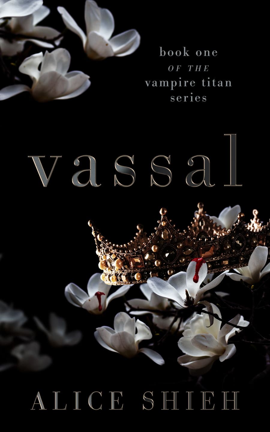
10. Vassal
Alice Shieh’s Vassal takes full advantage of its symbolic cover design. The flowers with droplets of blood dripping down the petals represent innocence lost. The Crown beckons images of royalty, wealth, and great fortune. One of the significant strengths of this cover is that it gives us all the pieces but doesn’t put them together for the reader. There’s enough mystery to encourage readers to read the back summary and hopefully buy the book.
Ebook Launch created this cover.
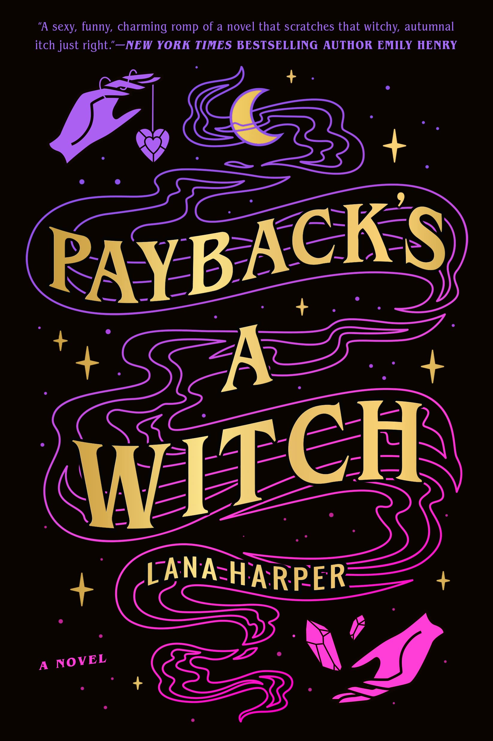
11. Payback’s a Witch
This bright-colored paranormal romance cover design plays with potential readers’ expectations.
Traditionally “witchy” images are given new life and energy with vibrant pink and purple colors against a starry black background. In many ways, this cover design is similar to A Court of Thorns and Roses by Sarah J. Mass. It relies on a reader knowing traditional fantasy rules and then plays against them. Because at the end of the day, your book, your rules.
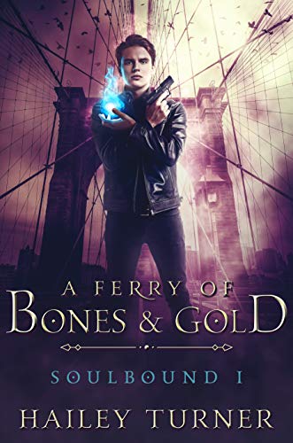
12. A Ferry of Bones and Gold
Putting your main character on the front cover is a power move. If you’re worried about this making your book look cookie-cutter or cliche—let me stop you right there.
Cover designs follow patterns of success. Sometimes the best move for your book is the popular move, a stand-alone main character, muted background, and a dark color scheme. Bestselling author Derek Murphy has an excellent article that explains how using cliches can help you sell more books.
Suspense Romance
Suspense romance can take place in the past, present, or future. Popular plots include cop-criminal partnerships, medical dramas, arranged marriages, family secrets, and serial killers on the loose.
Everyone’s a suspect, and that’s what makes these books so thrilling! Now add a sexy, muscled, ex-navy SEAL or bad boy drug dealer who’s willing to switch sides for the right partner, and you have a recipe for success.
Color Scheme: Suspense romance focuses on dramatic color palettes to convey passion, love, and vengeance. Darker colors can be vital, especially if you’re writing for adults or your book touches on darker themes.
Font Style: Font communicates the title of your book and how the reader should interpret the title. If there’s a murderer on the loose and characters’ lives are at stake, we need the font to flash across the page like a giant warning sign. Other font options might be procedural or styled like a typewriter.
Imagery: If you’re writing a slow burn, don’t be afraid to withhold information with your cover design. Let the background imagery soak up the page and trust your title to do the work it’s supposed to be doing. If your novel takes off running on page one, you might choose to have a busier cover design to let the reader know they need to buckle up!
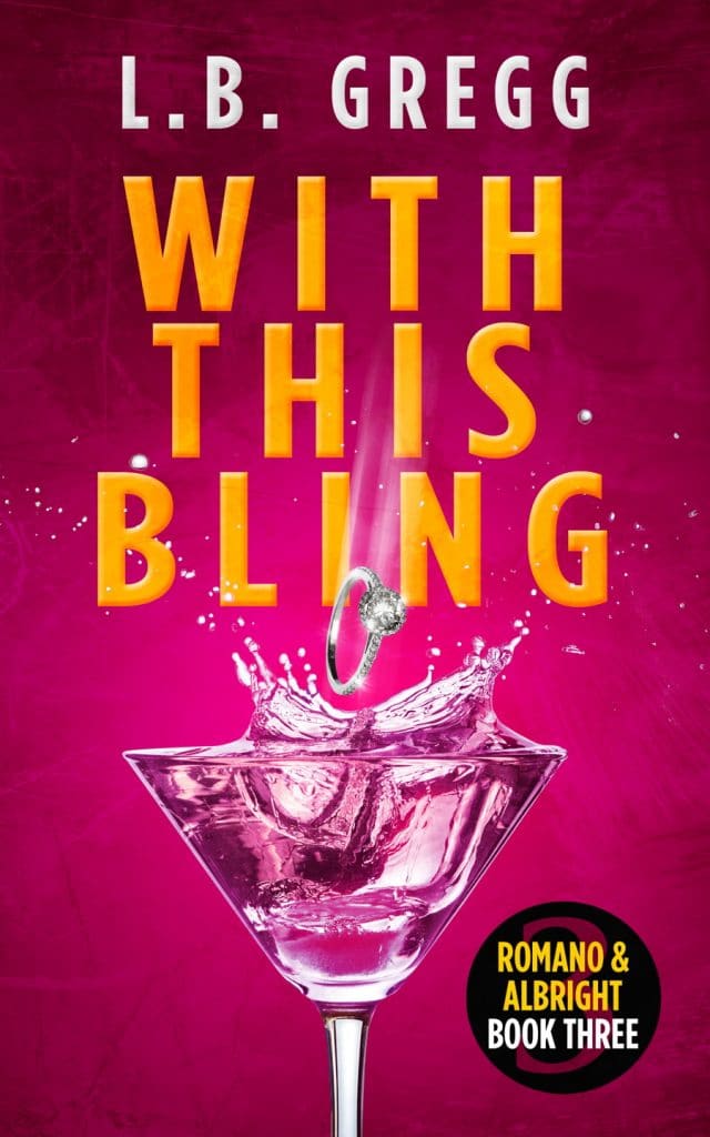
13. With This Bling
L.B. Gregg’s With This Bling has a delightfully flashy, ready-to-go cover design that promises to take readers on a romantic adventure.
The bright colors promote the idea that this is a fun story. The font is huge and written in all caps, but the orange color neutralizes any dark intentions. Imagine if the title was written in red (sounds erotic to us) or black (does someone kill their spouse?). All in all, this cover screams fresh, fun, and sexy.
Ebook Launch created this cover.
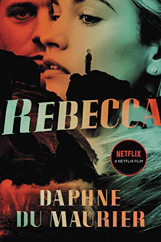
14. Rebecca
Rebecca is the original romantic thriller. This is one of our favorite cover designs that the book has worn since its initial release in 1938!
This cover isn’t afraid to play with color and imagery to create something unique. The layered images create a sense of mystery unfolding. Readers wonder why the male character is painted red or who the figure standing on the rocky seashore is. In many ways, this design prompts more questions than answers, but that hasn’t stopped thousands of readers from trying to solve the mystery for themselves.
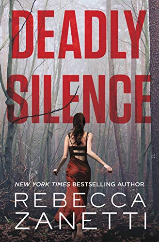
15. Deadly Silence
Rebecca Zanetti’s Deadly Silence book cover manages to walk the line between suspense, horror, and romance while wearing a floor-length dress. Thank God she ditched the heels!
This is a prime example of letting color do the heavy lifting. A vibrant color scheme would murder this novel’s creepy, haunting presence on the page. The shadowy background creates depth. And withholding the main character’s face means that readers will have to flip the book over if they want to discover who she is and who or what is chasing her.
Holiday Romance
Everyone knows someone who loves a good holiday romance story—maybe that person is you! Whether your book is about Christmas, Kwanzaa, or Chinese New Year, there’s a holiday miracle waiting right around the corner.
Holiday novels can be naughty or nice and have dedicated fan bases. Fiona Davenport’s Unwrapping his Package is an Amazon bestseller in several categories, as is One Charmed Christmas by Sheila Roberts. According to Publisher’s Weekly, readers start stocking up on holiday romance novels as early as September. The holiday book-buying frenzy lasts until Mother’s Day in early May.
Color Scheme: Tis the season for shades of mistletoe, snowflakes, and Santa hats. Holiday colors are a must if you’re writing a Christmas-y story. Otherwise, you want to match your colors to fit your holiday first, then the tone of your novel.
Font Style: Get creative with your font style. Embrace the idea that there are no set rules for how holiday novels have to act. If you want to write your title across the front cover in vanilla frosting, go for it! What’s important is that the font matches the tone of your text.
Imagery: Context is key here. As with any romance novel, you should consider the pros and cons of putting your main characters on your front cover. Illustrated romance covers are becoming increasingly popular, especially for romantic comedies.
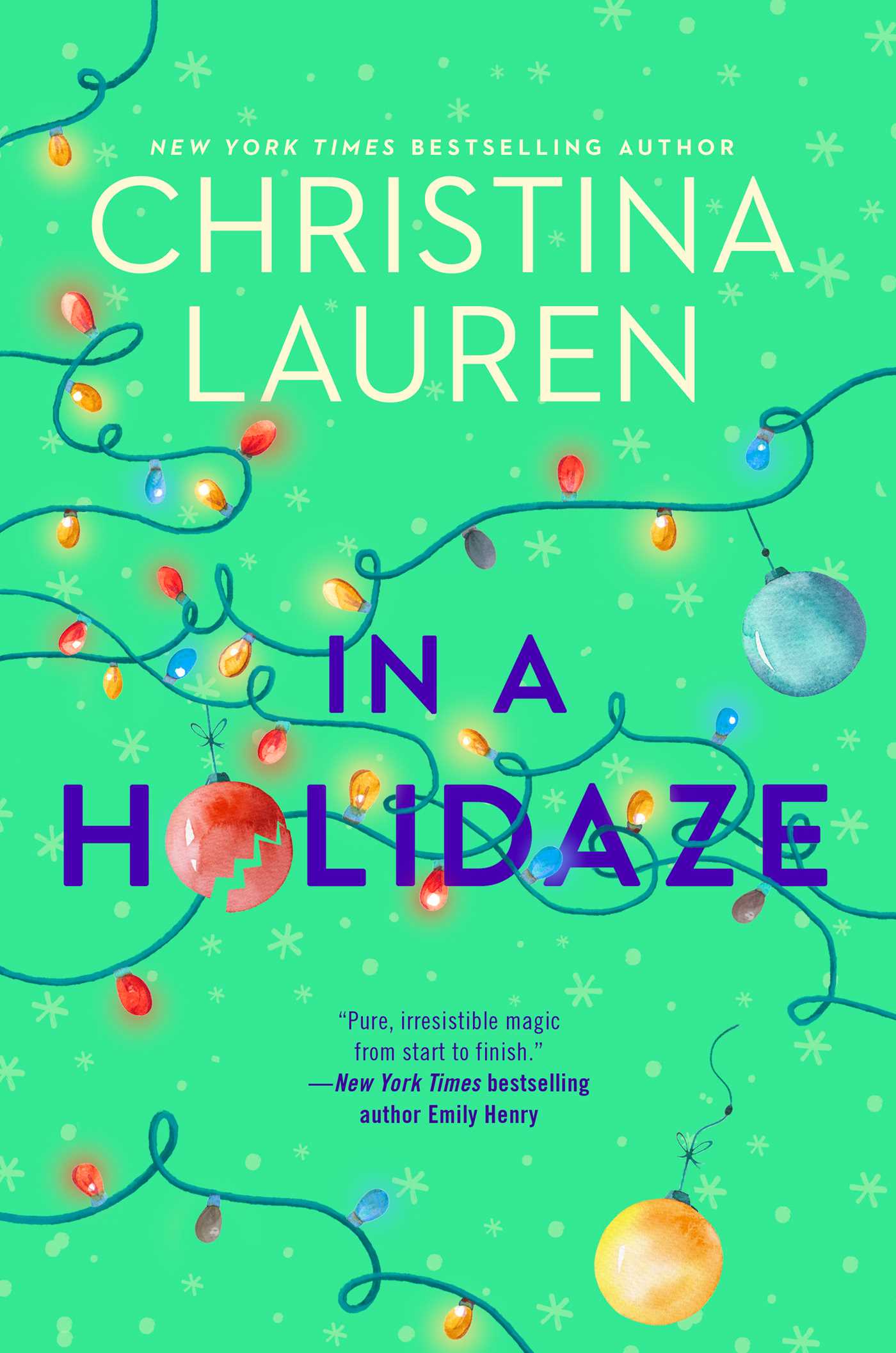
16. In a Holidaze
Christina Lauren’s fun and festive holiday romance book cover looks like the perfect bright green stocking stuffer to us!
The colors pop off the page and contrast nicely with the darker title color and font. The scattered, tangled, all-over-the-place Christmas lights help potential readers explore the entire cover page, pointing them towards the blurb at the bottom of the page, and centering most of the chaos back towards the title.
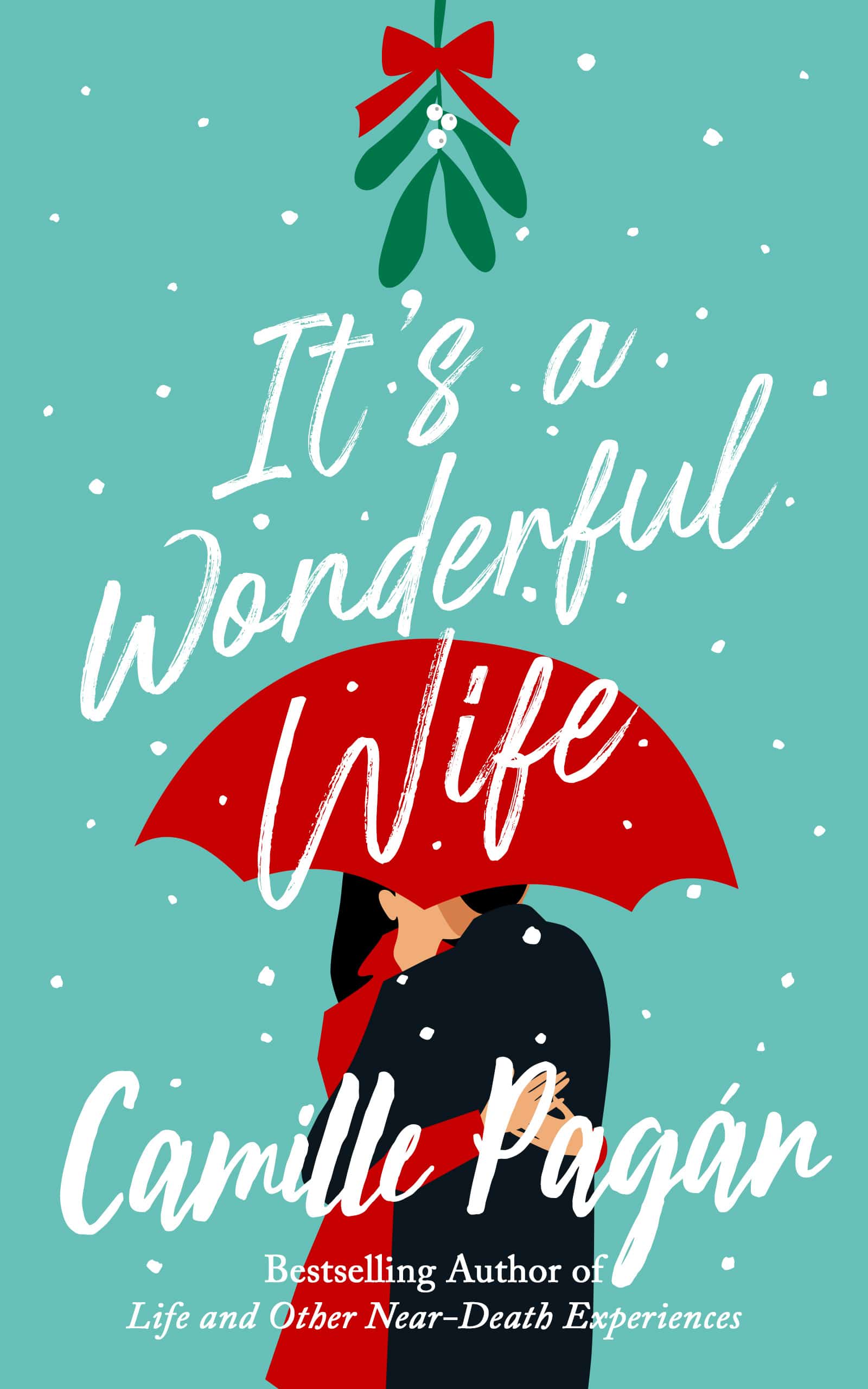
17. It’s a Wonderful Wife
It’s a Wonderful Wife takes advantage of a vibrant color scheme and familiar visual cues to create a timeless holiday romance book cover design. When readers first spy an exciting book cover, their eyes shift to the center of the page. A centered title that ends on an image can be a powerful design choice. For example, the word “wife” here leads to the couple’s image kissing under a festive red umbrella. As a fun exercise, try looking at other popular book covers and see where the images lead your eyes.
Ebook Launch created this cover.
18. Sweet on You: A Filipino Romance
Not every holiday romance story needs to be decorated like a Christmas tree. Sweet on You by Carla De Guzman is a holiday story with a delicious, unique cover design!
Since this story focuses on the romantic relationship between two Filipino characters, it was important to the author that her main characters be represented accurately on the book’s cover. Having your main characters showcased like this can help your book succeed with more niche audiences, as well as general romance readers. The colors and font styles fit the sweet, charming tone of the novel and set up the expectation that this book is perfect for reading in a comfy chair by a fire.

Funny Romance
Whether you call them rom-coms, cheesy romance novels, or romedies, everyone can agree that reading funny romance novels can be a great way to relax. Most romance novels will have a few snarky lines of dialogue or an ironic plot twist or two. But spit-out-your-coffee and die laughing romance novels are in a category all their own. These books will have you ugly-crying tears of joy as the main characters try to navigate strange and wonderful situations together.
Color Scheme: Bright colors are your friend when designing the perfect funny romance novel cover. You don’t want your book to be mistaken for a traffic cone, but give it some flash. Color clashes like red and blue are fun to play with because they create the idea in the reader’s mind that maybe opposites can attract—even if it seems hopeless at first.
Font Style: Sprawling handwriting and playful fonts are good options. A font that looks like text messages or frantically typed emails can also be enticing because they let readers feel like they are getting a sneak peek into your characters’ love lives.
Imagery: Imagery can be a lot of fun with funny romance novels, but don’t get so carried away that your cover looks cluttered. Several designers agree that putting characters’ facial expressions on the front cover can make or break the right tone for the book.
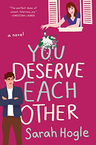
19. You Deserve Each Other
You Deserve Each Other is an excellent example of romantic comedy done right. And this cover design and title combination totally deserve each other.
The font is teasing and mischievous with the alternating colors. The illustrations give us flirty side-eyes and tilted chins without giving away too much of the plot. The minimalist cover design here feels vibrant and fresh. We know that these two will probably get together by the end of the book, but how? That’s the intriguing part.
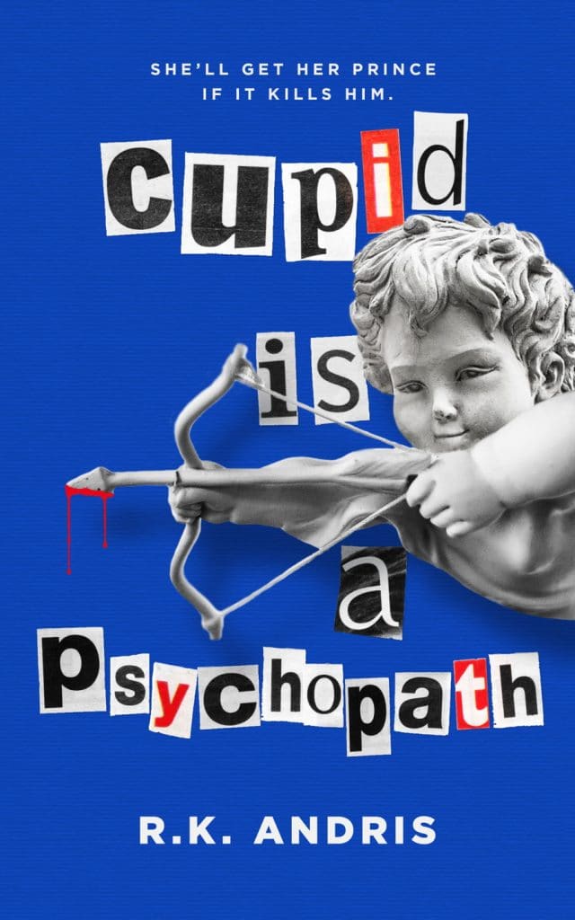
20. Cupid is a Psychopath
You want your book cover to spark readers’ interest or at least make them chuckle. Cupid is a Psychopath by R.K Andris is bright, charming, and a little psychotic. This is a social media / Instagram-worthy book cover that people can quickly scan and decide if they want to read it or not. Worst case scenario, they’ll likely share it with their friends, and that’s free word of mouth advertising!
Ebook Launch created this cover.
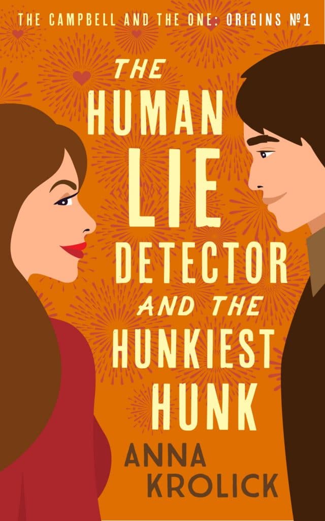
21. The Human Lie Detector and the Hunkiest Hunk
Anna Krolick’s illustrated book cover is a nice balance of imagery and text brought together to create a fun, rom-com vibe.
Notice how the characters stand like they are about to face off in a type of mega-battle, but their expressions say that they’re only one step away from make-out with each other. One of the joys of creating funny romance cover art is playing off readers’ expectations. A strong cover design sets the stage. Based on the fireworks between these two, I’d say we’re in for a great show.
Ebook Launch created this cover.
Erotic Romance
We’ll let you in on a dirty little secret: erotica romance novels are 4,000% more likely to sell than award-winning literary fiction. And this doesn’t mean that erotic writing can’t have sparkling prose alongside its tantalizing bedrooms scenes. It simply means your target market is already out there. And whether you love it or hate it, 50 Shades of Gray sold a record-breaking 200,000+ copies in one week and continues to be restocked in bookstores around the world. Your book could be next!
We also recognize that erotic writing is still considered taboo in some places. Just because you have sex scenes in your novel doesn’t mean you have to classify it as erotica. Romance novel guru Sylvia Day does an excellent job breaking down the subtle differences between pure erotica, erotica romance, and sexy romance.
Color Scheme: Colors that symbolize wealth, power, love, and lust are your friends. Imagine sharp black-tie suits, bronze archways and statues, bright pieces of jewelry hanging off your main character’s neck. Overall, darker colors make for a more appropriate and easy to decipher book cover design.
Font Style: Power dynamics play a tremendous role in erotic romance novels. Because of that, you want your title font to appear large and in charge. Split fonts–where half the title is in one color or typography, and the other half is the opposite color or style–display an equal power dynamic or that your novel shifts its point of view throughout the story.
Imagery: Open up your toy chest! Pull out the bondage ropes and sexy outfits. Your cover imagery tells the reader what sort of relationship they are about to walk into when they crack open your novel. Letting them know what your characters’ kinks are as soon as they see your book cover will help you both finish the book feeling satisfied.
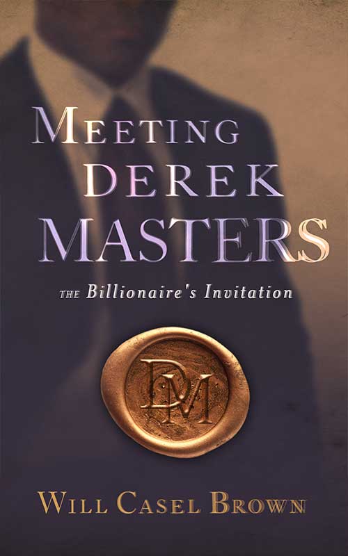
22. Meeting Derek Masters
We’re a little biased in favor of wax seals, but they are so effective on layered book covers like Meeting Derek Masters.
This cover design tells readers everything they need to know: Derek Masters is filthy rich—and he probably has perfect washboard abs and jawline to die for—and if you open this book, you’ll get to meet him. There’s a sealed, golden-colored invitation begging to be opened. The intrigue is palpable.
Ebook Launch created this cover.
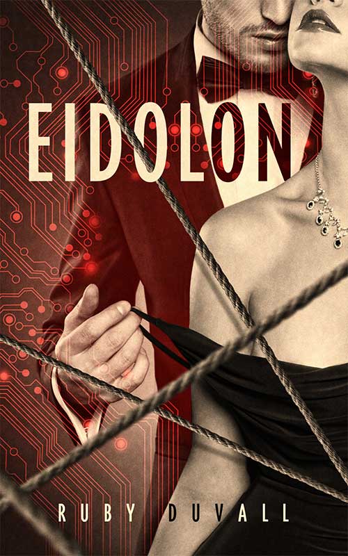
23. Eidolon
This alluring erotic romance cover is chock-full of whip-smart design choices, exploding colors, and vivid imagery.
You might wonder why we don’t see the protagonists’ faces on erotic romance book covers. The short answer is that in many cases, faces distract readers from their personal fantasies. Based on this cover design, readers can insert themselves as the woman dressed in the slip-off black dress, someone leaning in behind them, hot breath on their neck. The split title here highlights that we might see this novel from multiple perspectives or see two very different sides of our well-dressed man in red.
Ebook Launch created the cover.
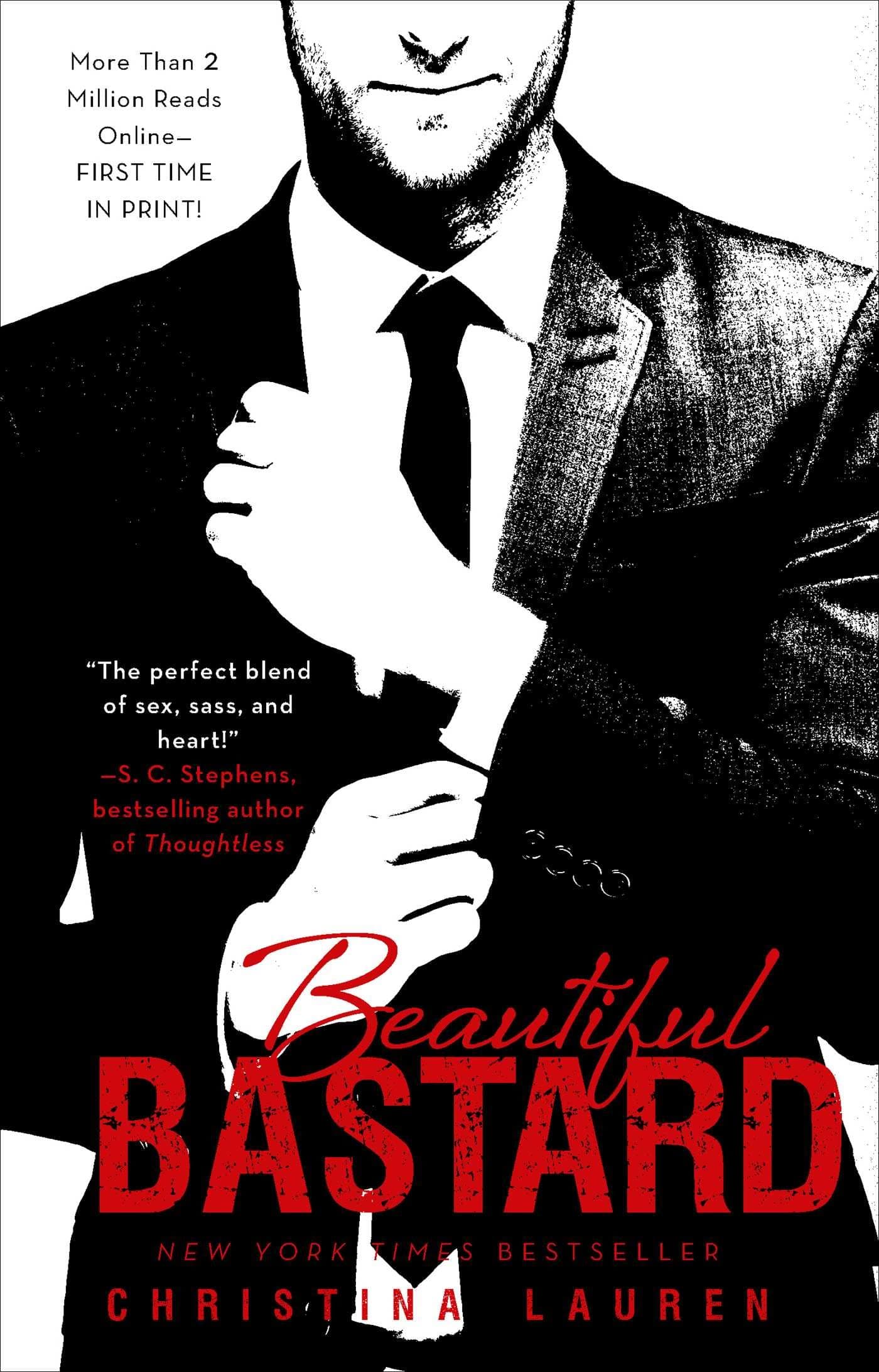
24. Beautiful Bastard
This timeless three-color cover design jumps straight to the point: there’s a new bad boy in town. He’s charming, sexy, and he’s got a soft side hidden under that expensive charcoal suit.
Bright white novel covers aren’t all that common, so this cover design will stand out on shelves lined with black and red dust jackets. The font encourages the idea that there’s more to this handsome stranger than meets that eye. Sometimes a simple cover design can speak volumes; remember 50 Shades of Gray? 200,000+ copies in one week? It can happen.
Inspirational Romance
This subgenre blurs the line between faith-inspired stories and clean wholesome romance. Readers who want to see emotional tension rather than the characters stripped naked enjoy inspirational romance novels.
Depending on how you’d like to publish your inspirational romance novel, there are some important subgenre requirements to keep in mind. Such as, how big of a role does the big man upstairs actually play in your book? You obviously don’t have to worry about a publisher’s requirements if you’re self-publishing. Yet, they can help you see how the market will potentially interpret your book.
Color Scheme: Bright colors are your friend. Colors found in nature symbolize growth and stability like yellow, blue, green, and brown. Don’t feel like you have to stick to a rigid color scheme if your narrative is about characters moving on or following a path that’s been laid out for them. Readers will generally be patient with a wandering color scheme as long it takes them somewhere fruitful at the end of their journey.
Font Style: Font styles can function as personal notes or prophecy, depending on what you choose. If your book has a first-person or a close third-person point of view, friendly whimsical typography might be the way to go.
Imagery: Place is often an essential aspect of inspirational romance. Use your cover design to reflect your novel’s place or what symbolic events occur in that space. If a particular activity like painting, music, or harvesting farm fresh apples brings your characters together, your cover should reflect that.
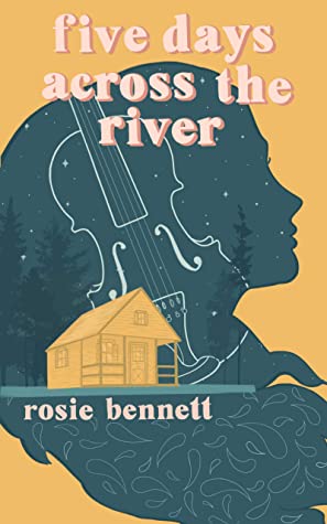
25. Five Days Across the River
Rosie Bennet’s debut novel uses a collage of symbolic images and dynamic color contrasts to create a stunning, multilayered cover design.
All the classic images readers expect, like location, character, and symbolic objects, are represented here in a way that smoothly transitions from one picture to the next. Bright yellow can symbolize personal growth or budding relationships, while blue often triggers deep introspection and serenity. The forest in the background is also a nice touch that adds depth to the overall cover design.
J Croft Design created this cover.
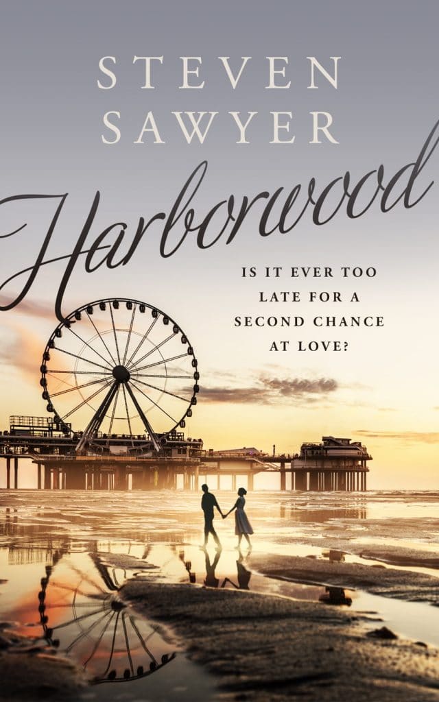
26. Harborwood
It’s hard to go wrong with a romantic walk on the beach, but that’s only one reason why Harborwood looks magical.
The color scheme is reminiscent of a twilight (or early morning) glow that gives us a picture-perfect scene of the two characters taking a delightful stroll. Inspirational romance covers should welcome readers into their worlds, and a cozy book cover is an excellent way to do just that.
Ebook Launch created this cover.
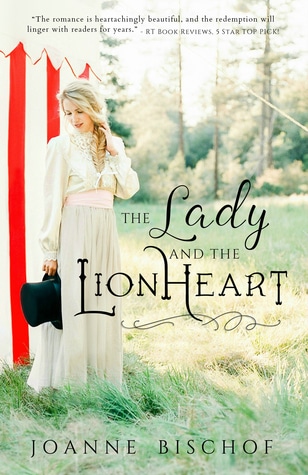
27. The Lady and the Lionheart
Lions under the big top, a damsel in a white dress, and love is in the air; a lot is happening in this circus-inspired inspirational romance.
The bright lighting pulls the whole scene together. Imagine how different this cover design would feel if the lighting mimicked a deep orange sunset or silvery midnight. Not to mention how to font style looks like something out of a fairy tale. We admire this cover design because of its sense of balance—mise en place, as the French would say.
Young Adult Romance
Young fans are important! And they make up a substantial portion of the romance genre’s target audience. According to Publisher’s Weekly, most romance readers discovered the genre between ages 11 and 18. And they continued to devour books long after they left high school.
Young adult books focus on themes and characters relevant to pre-teens through college graduates in their twenties. Characters in one YA novel might be experiencing their first kiss, while others are dealing with pregnancy. Young adult romance novels are also a hair shorter than the average romance novel, averaging 65,000 words per love story rather than 80,000.
Color Scheme: YA romance novel cover designs can work in a variety of colors. Bright colors can mimic the fireworks bursting in a young protagonist’s chest when their first love agrees to meet them for a movie date. But don’t be afraid to venture into darker tones if you’re dealing with complex or heavy subject matter. You don’t want your readers to like you’re babying them.
Font Style: The fonts you choose give readers insight into your main character’s personality and fun quirks. Let your characters have a voice in your font choice. Would they want the title to be written thoughtfully, wacky, or covered in glitter?
Imagery: Time to pull up those Pinterest vision boards! Since young adult romance novels cater to both fifteen-year-olds and twenty-five-year-olds, make sure that readers can quickly tell which books they are most likely to enjoy. This can be done by integrating specific imagery that will resonate with different aged readers.
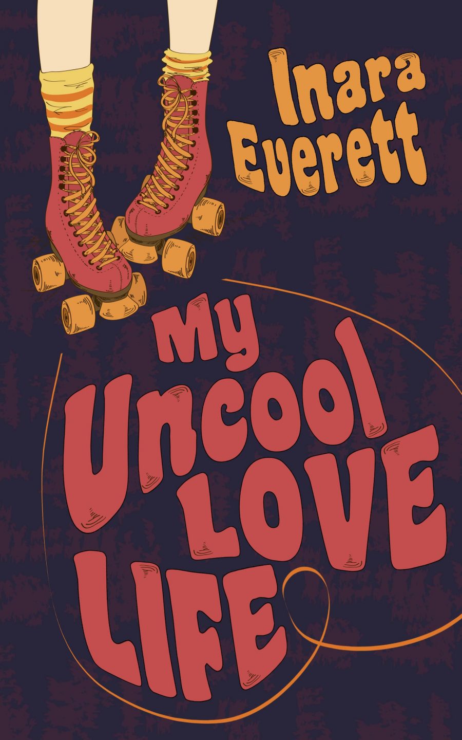
28. My Uncool Love Life
This retro-themed young adult cover design hits just the right balance between high-school awkward and first crush cute.
Sometimes subtle color changes can work wonders. A light red on a soft black background has a much different feel than a bright, intense red on a pitch-black cover. The residual effect is a more thematically balanced cover design that works within the romance and YA genres.
Ebook Launch created this cover.
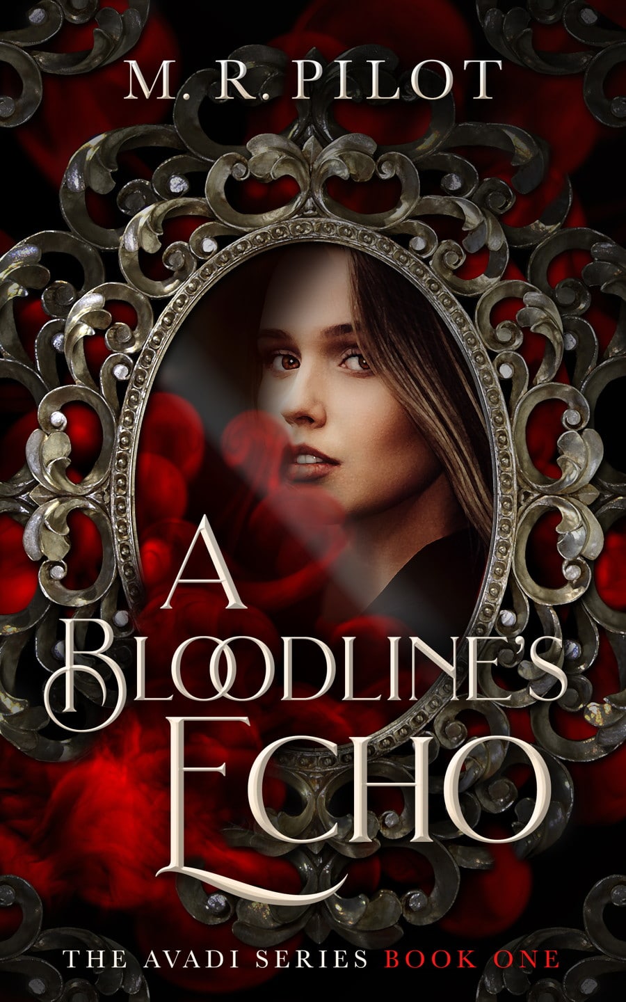
29. A Bloodline’s Echo
This cover entirely agrees with and engages the novel’s title, A Bloodline’s Echo. Readers get a chance to meet the main character right away and can quickly observe that this is a young adult novel that deals with magic and romance galore.
On average, readers (especially YA readers) spend only eight seconds trying to understand your book’s front cover. How long did it take you to scan this cover? Did it pass the test? It did for us!
Ebook Launch created this cover.
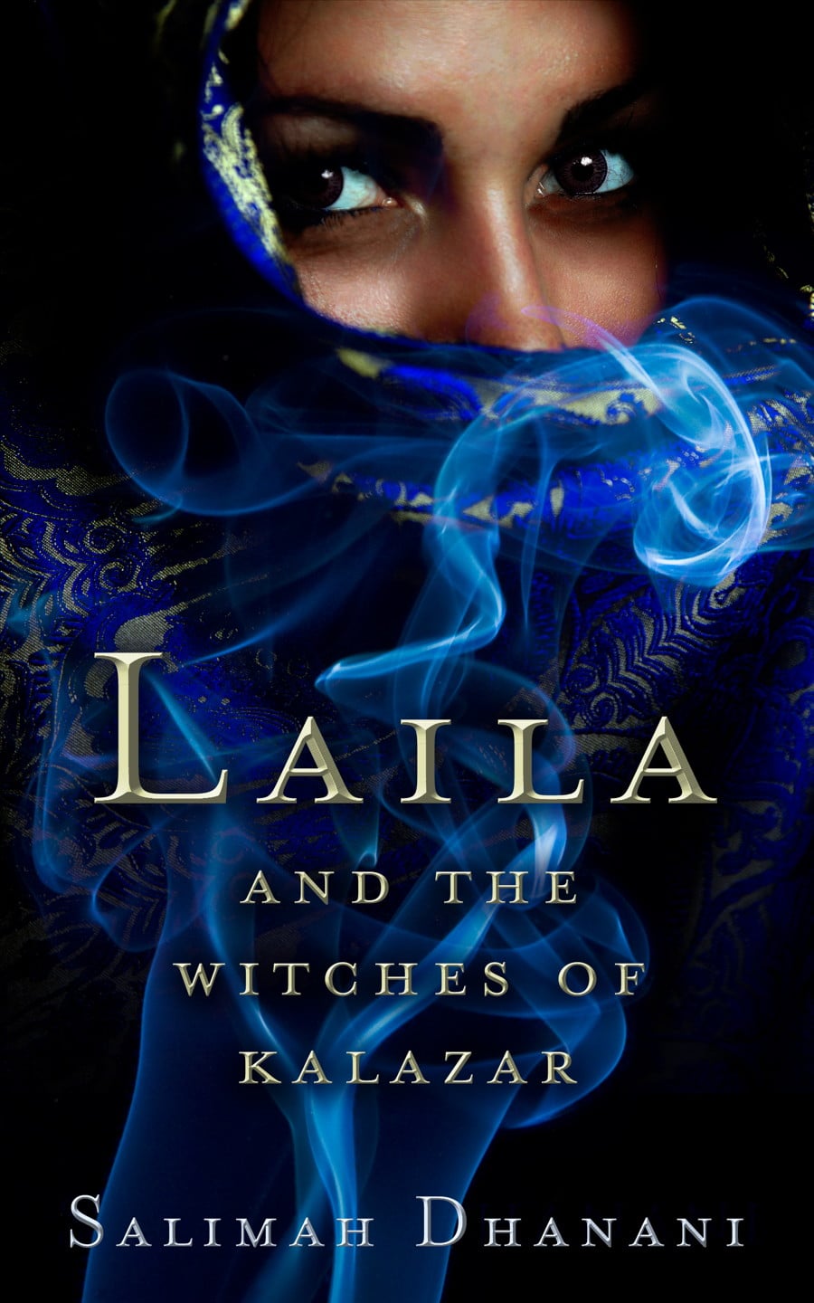
30. Laila
Laila by Salimah Dhanani works on several levels to create intrigue and magic out of thin air! Having a picture of the central protagonist on the front cover can be important for several reasons.
Suppose you’re writing about diverse characters that belong to a minority group. In that case, it can be critical that your book cover represents that. This doesn’t have to be done strictly through images. Fonts and colors can be symbolic as well. Creating a cover that is an accurate representation of your romance novel is vital.
Ebook Launch created this cover.
Helping Your Romance Novel Find the Perfect Cover Art
Nothing is more attractive than a smart, well-dressed cover design. Every book deserves a cover that will sweep it off its metaphorical feet and tenderly deliver it into the hands of happy readers.
Hopefully, the romance novel covers we discussed can help you discover what’s right for your story and to consider what makes a good book cover design. You can save this page as inspiration or check out some of the authors mentioned above who are writing in the same subgenre as you.
Want to see more? Feel free to check out our custom book cover portfolio with hundreds of sample covers or design packages. Or, try your luck to see if we have an option for you with one of our premade romance book covers.