
Your fantasy book cover design is incredibly important.
But you already know this, right? You wrote a killer story with spectacular characters and fantastic plot twists! Oh, and your writing is cleaner than a hypochondriac’s toothbrush. That’s why having an amazing cover design should be an essential part of your successful book launch.
In this article, we are going to take a deep dive into fantasy book cover design strategy and teach you how to look at your book like a cover designer. So, let’s get started!
What Makes a Good Fantasy Book Cover?
There are some general things to keep in mind when considering what makes a good book cover. However, when it comes to specific genres, it will vary depending on your book! Are you writing an epic fantasy novel with kick-ass assassins and magical wizards? Or are you writing a romance novel for young adults? Whether your readers are browsing literal bookshelves or swiping through Amazon, a solid fantasy book cover design helps boost sales and get people talking about your book.
Content influences cover art. Readers are looking for clues on your book cover that let them know what type of story to expect. Are there drops of blood running down the spine? That can signal thriller, murder, or paranormal elements in your story. Think about the New Moon book cover from the Twilight series. You can immediately tell it’s a paranormal romance because of the black and white coloring and blood-inspired imagery.
Is there a particular character or setting that your cover should feature? A hooded figure or dark-colored landscape can signal that you are telling an other-worldly or epic narrative. Consider famous high fantasy books like The Name of the Wind or The Way of Kings as excellent examples. These fantasy book cover designs signal that the characters will have a traditional quest-structure in the novel ahead of them.
Choosing the Right Fantasy Book Cover Design for Your Story
You know the difference between a good book cover and a sloppy one. Now we will apply that knowledge to your own story using clever color schemes, eye-catching fonts, and clear images. All of these features are critical to helping your book look professional and down-right magical.
Here we have 25 fantasy book covers created by the Ebook Launch experts that you can use as inspiration for your own book. We broke them down into six categories:
Adult Fantasy
Adult fantasy novels are full of lore. You want your cover to reflect your central hero (or heroes) and focus on the themes that permeate your story.
Color Scheme: Typically, adult fantasy book cover designs will use a darker color scheme to remind readers that this isn’t a book that you would necessarily read to your kids at night. Imagine evil dark red shadows and mystic green lights.
Font Style: Adult fantasy novels feature more authoritative or “aged” font. This can reinforce the age of the world. A world that’s as old as dirt deserves a different font than one that has just recently been created.
Imagery: pictures or imagery for adult fantasy novels ranges from symbolic like the One Ring on the cover of The Fellowship of the Ring to completely immersive like the cityscape on the cover of The Lies of Locke Lamora.
1. Raven Song by I.A. Ashcroft
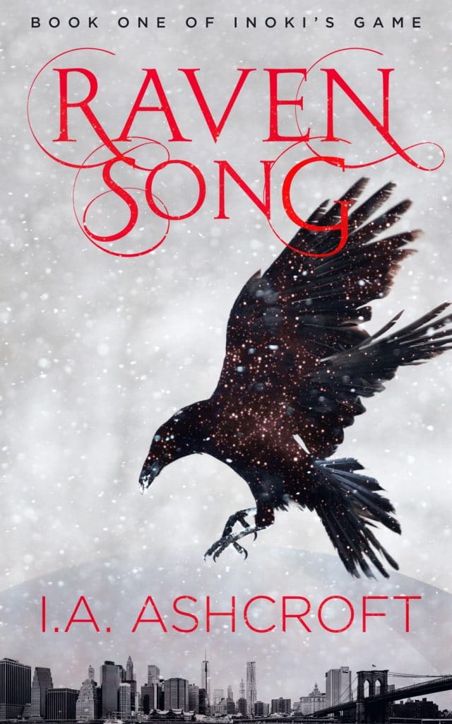
Raven Song uses a snowy, greyscale background to make the raven really pop off the page. The font implies lore, and this cover could also easily fit into a series since it features one central image that could change as the series evolves.
2. The Dragon Knight’s Curse by D.C. Clemens
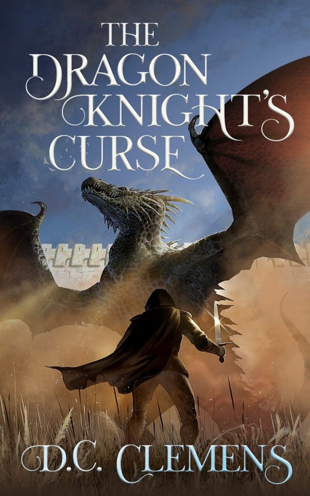
The Dragon Knight’s Curse has a traditional fantasy cover design that immediately introduces readers to the story’s central plot. Plus, we get a great dragon sighting! The dark coloring signals that this is an adult fantasy novel, and the gleam of the hooded figure’s sword draws attention to the conflict at hand.
3. A Storm of Shadows and Pearls by Marion Blackwood
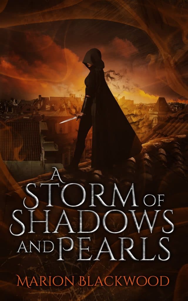
This richly layered cover gives us the best of both worlds with a central image of our protagonist backlit by her fantasy landscape. We get a glimpse into this epic fantasy that pairs well with the title of the novel. If your story has a longer title as this one does, placement and size ratios become crucial to getting the most out of your cover design.
4. Warrior of Light by William Heinzen
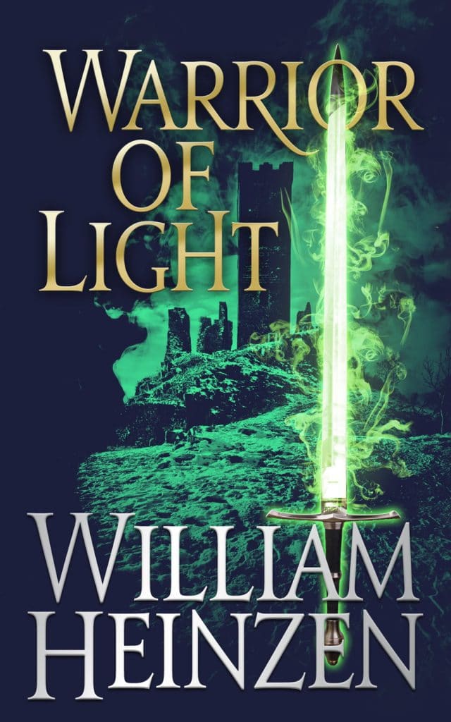
This mystic green cover design combines the best elements of fantasy and historical fiction. The scenery in the back of this cover gives us medieval world vibes, and the bright green sword does a neat job of tying the title and imagery together. The color green often symbolizes the environment, greed, chaos, and life. Dark green coloring like we have here can represent the corruption of those symbols.
5. Feast of Fates by Christian A. Brown
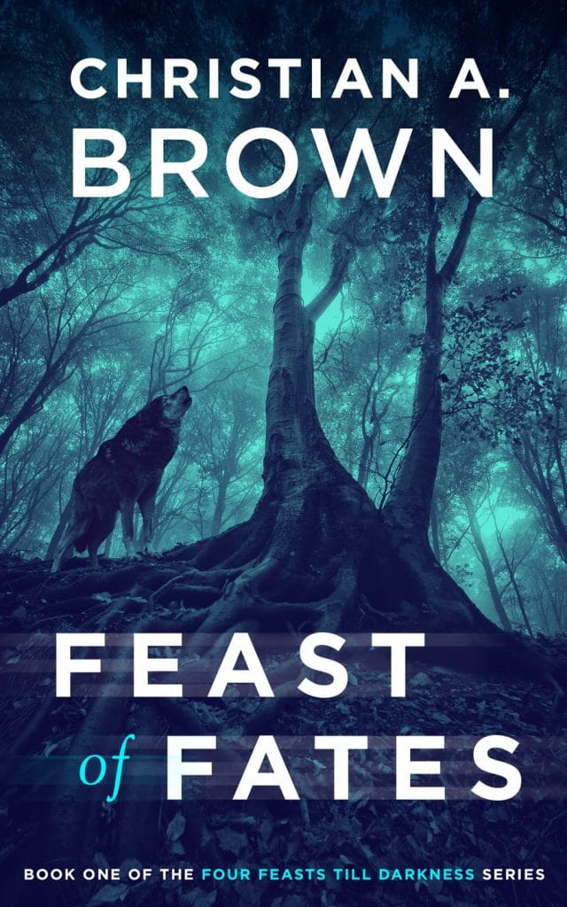
Feast of the Fates features a dark blue cover design with contrasting white font. The color blue can represent mental engagement or spirituality. In a fantasy setting, this can let readers know that destiny and fate play important roles in the text.
YA Fantasy
The young adult market is super competitive. YA fantasy novels are a fan favorite among readers and writers! You need a cover that can captivate teen and adult readers (adults make up a huge chunk of the YA market).
Color Scheme: YA fantasy book cover designs can work in a variety of colors. It really depends on your content (darker colors = darker content) and your intended audience. If you’re skewing towards a younger section of the YA market, your cover design is a great place to show that. The Selection Series is an excellent example of this.
Font Style: Many YA novels are written from the first-person point of view. As such, the font and size of your title can tell readers if your protagionist/s has a big personality, quirky habits, or even dark secrets. A quick exercise you can do is imagine how your main character would write the title of your book.
Imagery: As with adult fantasy, imagery can be symbolic, or it can be a literal picture of your character or their world. Most fantasy book cover designs incorporate a combination of both.
6. Breaking the Ice by Katherine Brashear
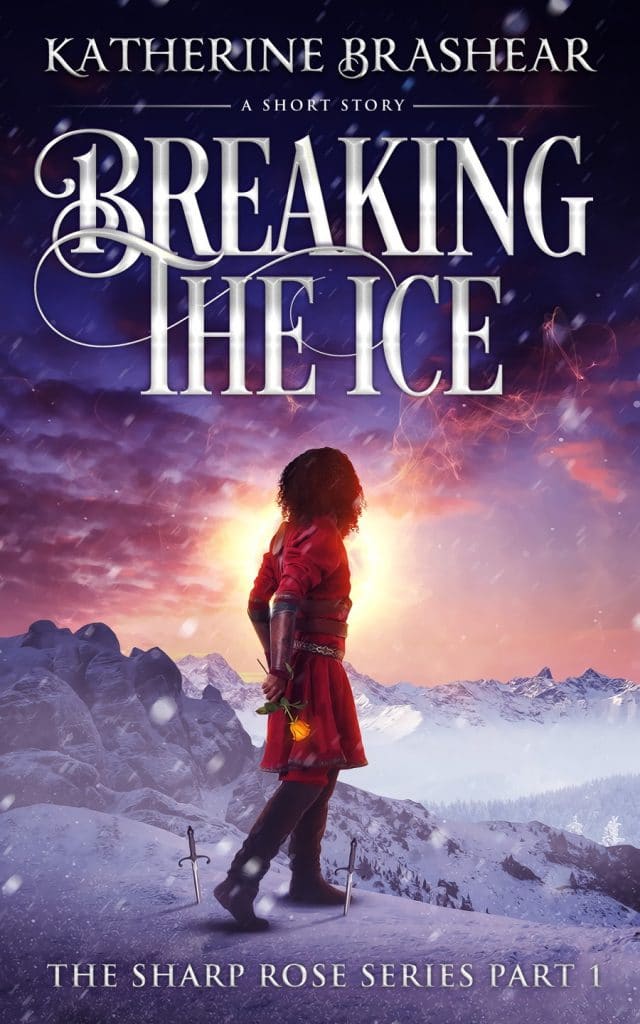
Breaking the Ice provides a near-perfect example of how to use a color scheme in a cover design. The bright light around the main character draws readers’ eyes to the center of the page. We can also tell from the imagery that we are dealing with a young (but also bad-ass) protagonist based on her size and the two shiny daggers at her feet.
Also, show of hands, how many of us are giving our main characters daggers? Maybe we need to reevaluate who gets a knife.
7. The Dreamshifters: Parallel One by Harry Dayle
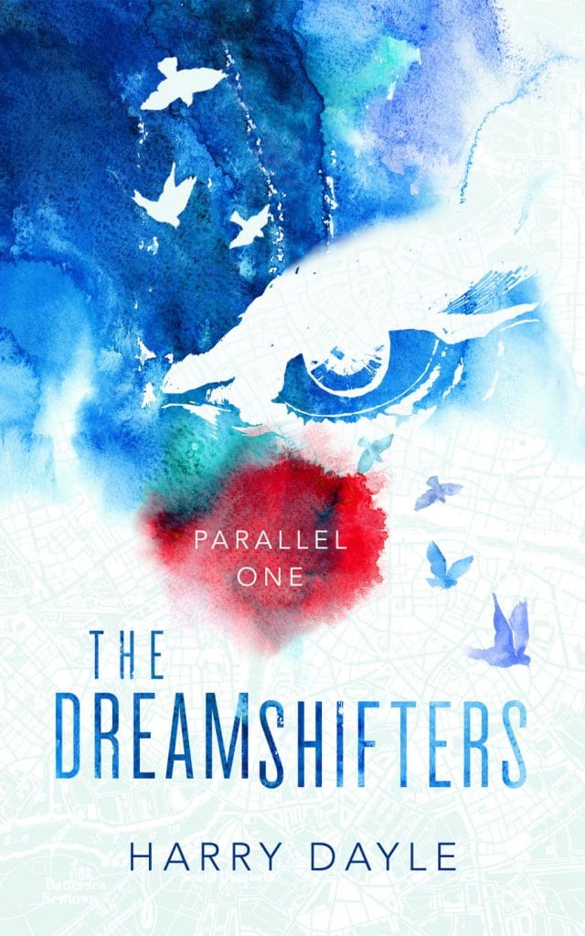
The Dreamshifters gives us a high-concept cover design. The layout creates an eye-catching image (literally) that readers can understand from a distance but also includes details that you can only see if you were to take a step closer. The longer a potential reader spends looking at your cover, the higher the chance they buy the book!
8. Curse Painter by Jordan Rivet
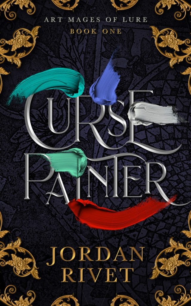
The Curse Painter has fun, brightly colored brush strokes decorating its front cover and layered over the darker blue and gold base design. Without the bright colors, this cover could have easily looked much darker and more brooding. However, the imagery brings balance. Plus, it gives a huge nod to the main character in the novel.
9. Snow White’s Walk of Shame by Scott Baron
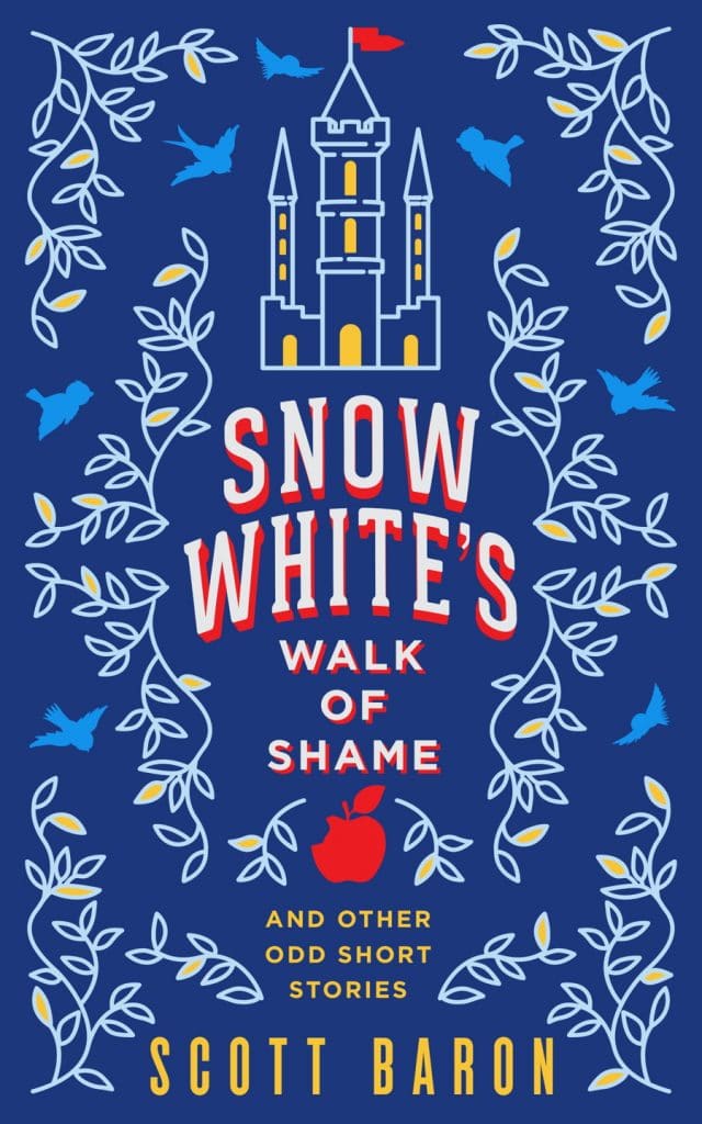
Fairytale retellings often pop up in YA fantasy books. They allow teens to reevaluate some of their favorite stories from childhood from a fresh perspective. This cover incorporates that classic imagery with the castle and apple images then shines a new light on them with a bright color palette.
10. Among the Stars: The Midnight Plot by Matthew K Wyers
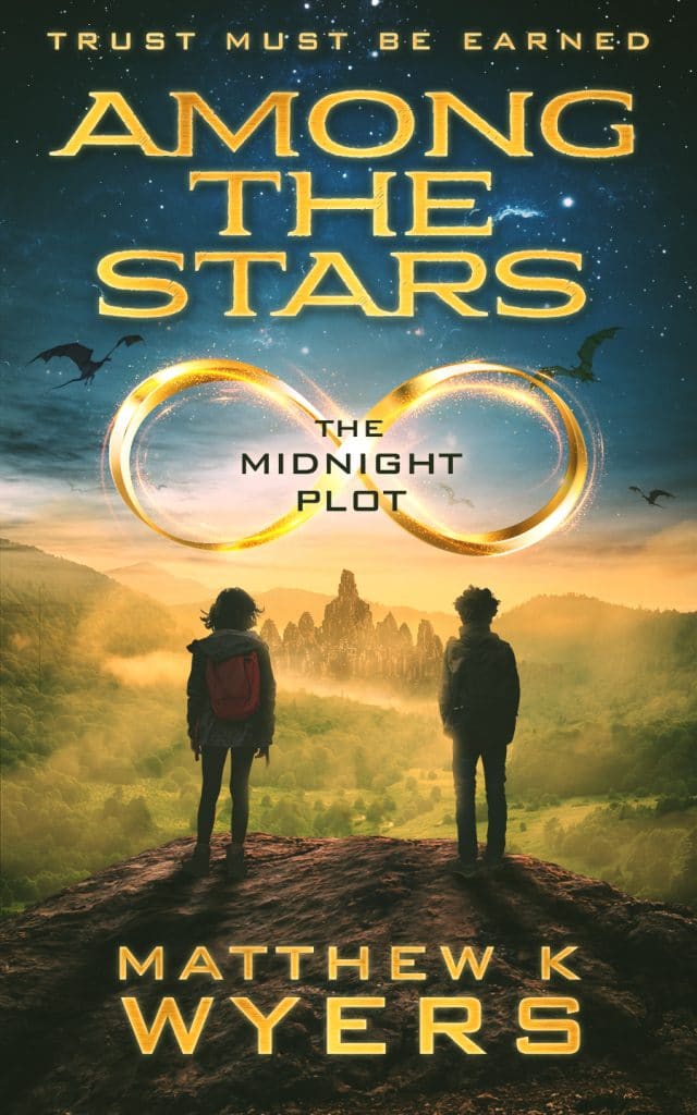
Among the Stars: The Midnight Plot brings together font, imagery, and color to create a professional cover design. The central reason that this cover design works is that the images here aren’t competing with each other or the title for the reader’s attention. Also, the contrasting bright gold font layered on top of the dark, starry sky makes an outstanding appearance.
Middle-Grade Fantasy
Middle-grade readers are known to devour books left and rights, but they can be extremely loyal to their favorite series. To convince these devout book-lovers to read your book (or series), you need a straightforward, easy-to-understand fantasy book cover design.
Color Scheme: Bright colors are a must! These readers wanted to feel invited into your world, so your cover needs to look and feel approachable.
Font Style: Fonts should be large and easy to read. A popular example of an unforgettable middle-grade font comes from the Goosebumps series.
Imagery: Young readers might struggle to get excited about a symbolic or high-concept design. Instead, use the front of your book to showcase your main characters or the amazing fantasy world that they are entering. This doesn’t mean you have to have fluffy bunnies and rainbows on your cover. In fact, zombie bunnies under a full moon might be perfect. It depends on the content of your story.
11. The Afterlife by Eric Kent Edstrom
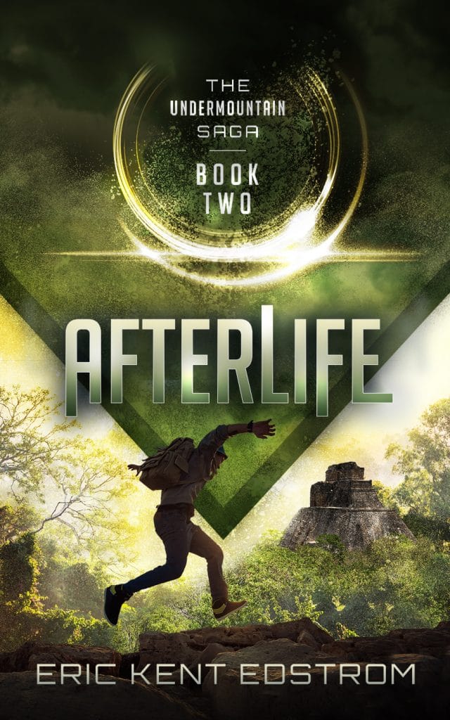
The Afterlife is an excellent example of how to integrate danger and mystery into a middle-grade book cover. We see our main character is on the run in a strange landscape, but the cover isn’t so dark that it’s “scary.” The font also helps lighten the mood without killing the mystery.
12. Fantasy Online by Harmon Cooper

Fantasy Online showcases a litRPG book cover and how it can bring its characters to life for a potential reader. A kid/teen who loves video games might recognize the characters on this cover and be bought into the story before even opening the book!
13. WenWorld by T.R. Preston
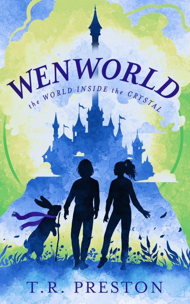
This cover design gives off Walt Disney world vibes. The images of the kids and the rabbit inviting them along for an adventure gives this book a whimsical feel. The coloring here promotes a sense of calm from the blues and adventure/nature from the greens.
14. Finding Fairy Tales by Kate Ramsey
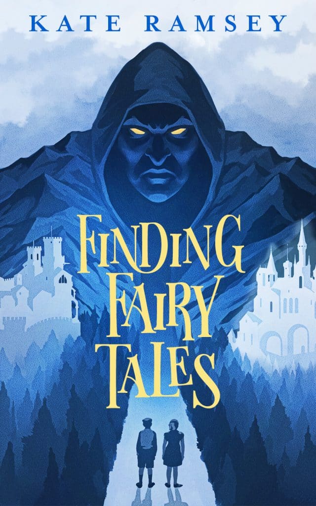
Notice how Finding Fairy Tales inverts the color scheme of the book above it. Here the blue takes on a darker shade (and darker connotations), and the light green is shrunken down to a sliver of hope. Without knowing anything else about this book, we can tell from the cover design that we are about to see the darker sides of some classic fantasy characters.
Urban Fantasy
Urban fantasy book cover designs can be tricky. Visually blending magical elements with the mundane can be done in several different ways, just like in prose. And since urban fantasies tend to overlap with other genres like romance, paranormal, or YA (or all three!), they can have very specific needs.
Color Scheme: Strong color contrast is often used with urban fantasy covers to show the split between the “real” world and the magical one. Think of popular cover designs like Twilight, Daughter of Smoke and Bone, and The Mortal Instruments.
Font Style: Fonts for urban fantasy novels act as bridges. If color is going to contrast, you want your font to tie everything back together.
Imagery: You have tons of options for imagery when it comes to urban fantasy stories. Sometimes it can be overwhelming to have so much choice. One tip is to use your imagery to showcase your subgenre: if you’re writing an urban fantasy romance, let readers know! Is your story more of a dark, gritty urban fiction? That works too!
15. A Song of Three Spirits by J. Zachary Pike
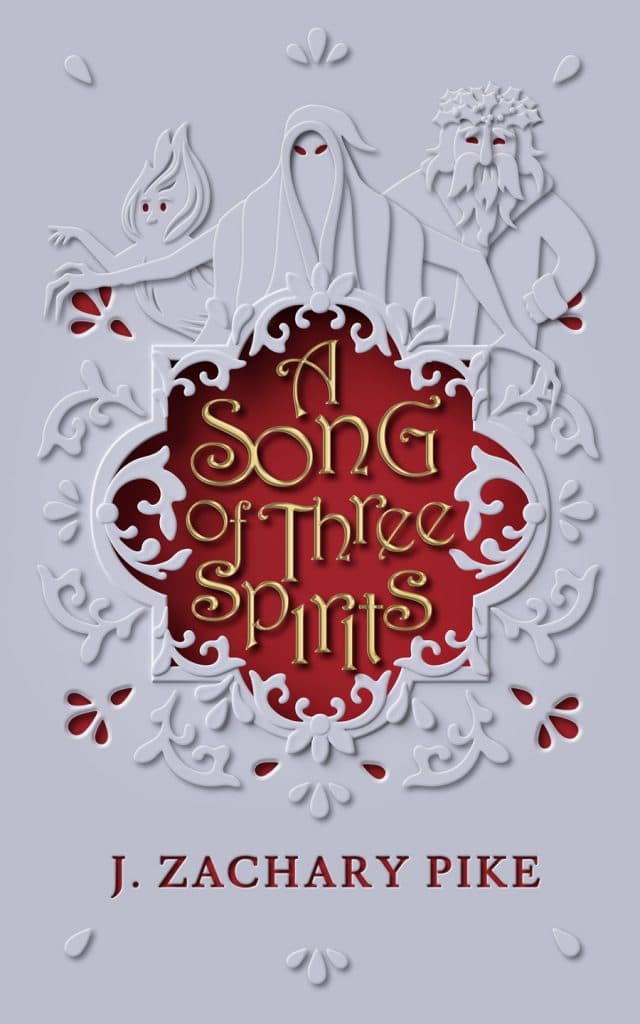
Right off the bat, we get a clear color contrast with the white and red. White can symbolize purity or innocence. Red is more often used to represent passion, lust, anger, or destruction. The imagery here also creates the shape of a door, giving readers another indicator of urban fantasy.
16. Genie by Alan Killip
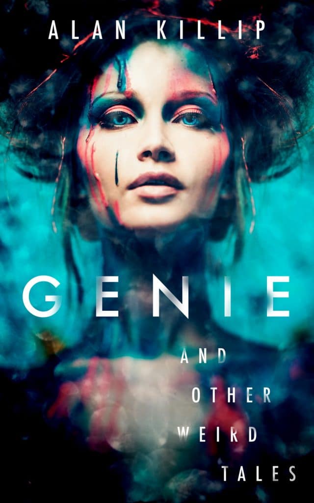
Genie uses various colors to create a sort of surreal image that reflects the short story collection’s central themes. Notice how the title spreads across the page. The capitalized font lends authority to the title. The color scheme adds mystery. There’s no apparent good and evil in this design, but that works in its favor.
17. Angels at Last Light by Jameson S. Pabes
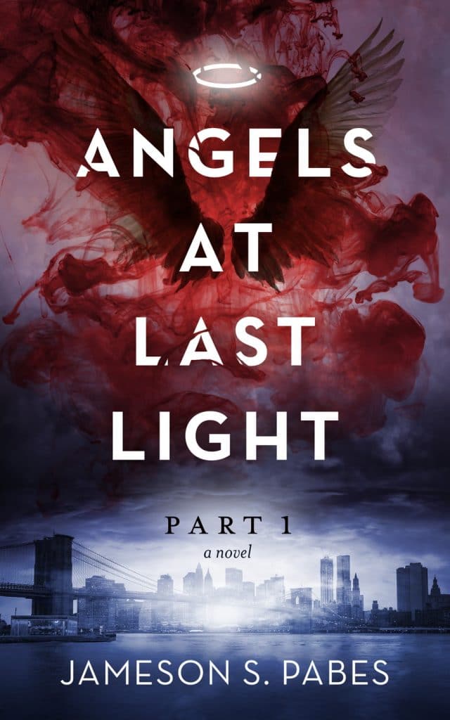
Unlike the last cover, Angels at Last Light has a clear color split with glimmers of hope on both the top and bottom of the page. We get a traditional cityscape on one half of the cover and a beautiful, dangerous pair of wings on the other half. Notice how the font bridges the gap between the two.
18. Dreamstalker by C.E. CzernieJewski
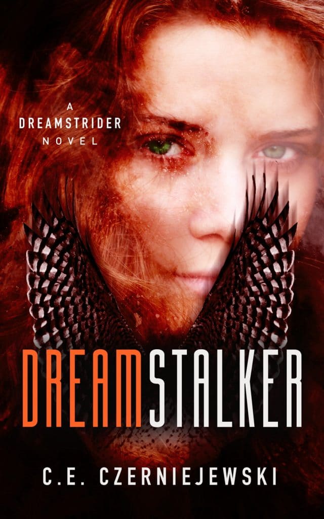
Dreamstalker gives us hints of YA because we can see the protagonist’s face. However, it also integrates symbolic imagery with the orange/reddish wings. Here our color contrast is most clearly seen in the title font.
Sci-Fi Fantasy
Science-fiction fantasy offers endless design options. The difficulty with this sub-genre is making sure that you’re giving readers a cover that is engaging without being overly complex. It’s tempting to try and fit your entire planet on the cover, but some of the most famous sci-fi fantasy novels have deceptively simple cover designs.
Color Scheme: Most sci-fi fantasy novels trend towards a darker color palette. However, sparks of light or bright colors can accomplish two goals for readers: first, they let the reader know that something magical is happening here, and secondly, they can add shine to an otherwise dull page.
Font Style: Science-fiction novels typically have more standard or serious fonts. Sci-fi fantasy blends are open to more creative writing styles, but it depends on your intended audience and content.
Imagery: You have tons of creative freedom with this type of book cover but don’t run so wild that people can’t quickly look at your cover to figure out what’s going on. Simple is good. Dune is a great example of this; the novel is anything but simple, but readers can easily understand the cover imagery.
19. From the Ash by Dave Heron
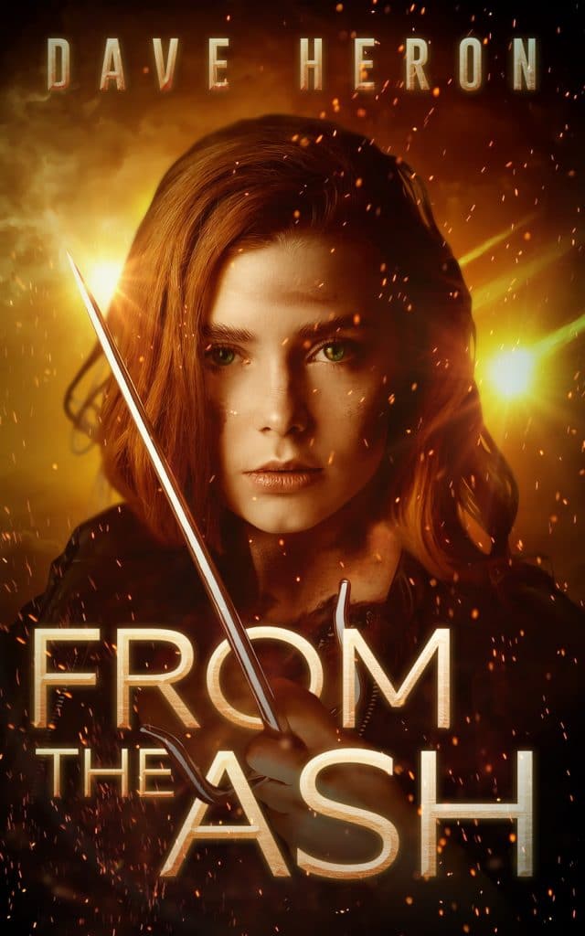
From the Ash has a mostly yellow, orange, and black cover design, giving it a survivalist vibe. The color orange in the cover design often represents change, rebirth, or growth, as clearly demonstrated here.
20. Red Right Hand by Chris Tullbane
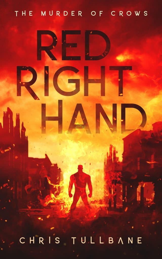
Who doesn’t love a good apocalypse? The Red Right Hand’s sci-fi fantasy book cover design is structured similarly to a comic book cover. It features a central figure surrounded by dangerous events that foreshadow what might happen next. The font is neatly folded into the cloud imagery, and the color scheme points towards this being an intense read.
21. Dream Me by: Kathryn Berla
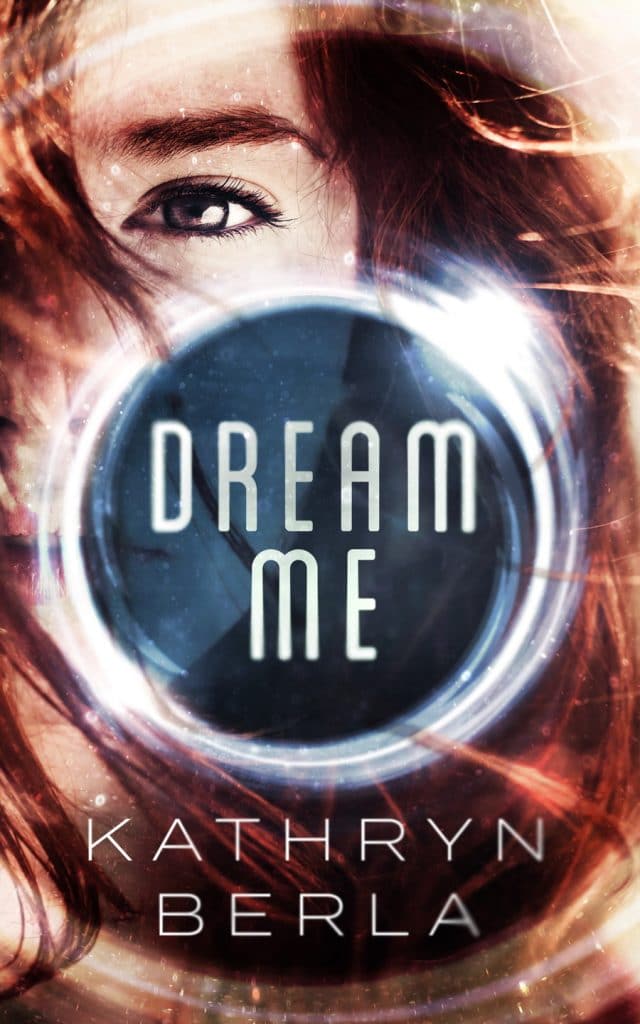
This cover design gives us a glimpse of our protagonist as well as a symbolic image of an eye with the novel’s title at the center. The white shine around the title and at the edges of the book cover does an excellent job of directing potential reader’s eyes to the book’s title.
Romance Fantasy
There’s a lot more to designing a fantasy romance cover than just slapping a muscled-shirtless figure on the front cover (not that it’s an awful idea…). You want readers to understand what’s at stake with your cover design, whether you’re writing about a dynamic love triangle of superhumans or a pair of star-crossed wizards. Don’t feel trapped into making your cover look cliche. Instead, lean into what makes your novel different from a typical love story.
Color Scheme: Romance fantasy novels often use dramatic color palettes to convey passion, love, and even vengeance. Don’t be afraid of using darker colors, especially if you’re writing for adults or your book touches on darker themes.
Font Style: Fonts let us know how serious (or potentially dangerous) your romance fantasy novel is. Consider the font style of The Princess Bride: it’s lighthearted and traditional. Choosing the right font helps readers get in the best mindset for your story.
Imagery: Readers need to fall in love with your protagonists in romance fantasy. It’s part of the genre appeal. Giving readers a visual of your main character or one of their best features (It might be their amazing abs or their eyes, who knows?) is a popular way of doing that. If the romance in your story is secondary to the fantasy world that it’s set in, show us that world! Let us love it just as much as you do!
22. Lightness Falling by Stacy Marie Brown
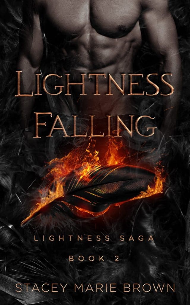
Lightness Falling creates a smoldering cover image through its dark coloring and shadowy images. We understand that this is a romance novel with some serious consequences, and possibly some angels vs. demons too.
23. The Fallen Gates by G.M. Gabriels
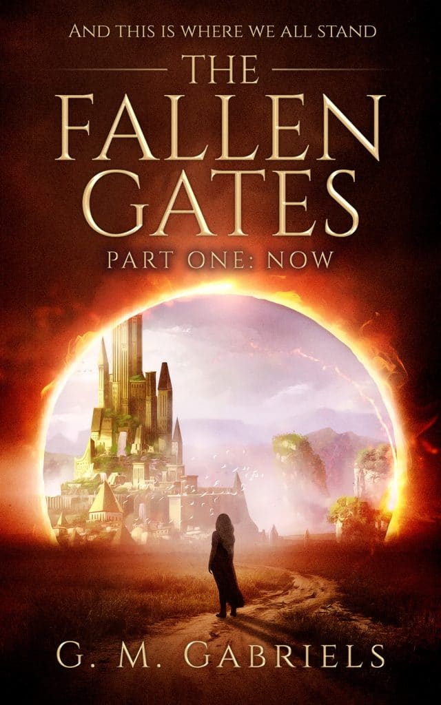
The Fallen Gates takes a different approach. It focuses on the fantasy world first and the protagonist second. Notice we still have a darker color scheme that uses lots of red, black, and pink, all colors that can make our brains unconsciously think of love or anger.
24. Vassal by Alice Shieh
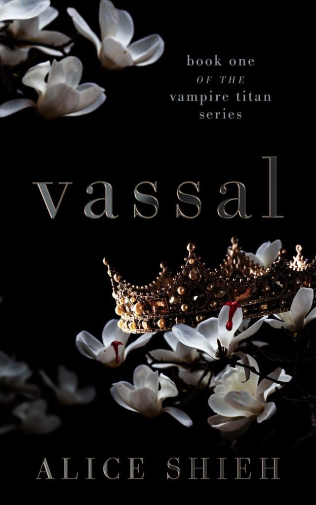
This cover is dripping with intrigue. I adore the light and shadow play on the cover of Vassal by Alice Shieh. The drops of blood on the white flowers give us hints of vampiric activity while the other images contrast dark and light beautifully.
25. A Betrayal of Time by Lucia Ashta
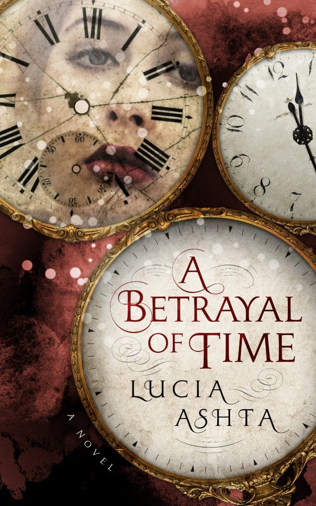
A Betrayal of Time is a stunning book cover that gives us a glimpse of our protagonist’s face through the lens of a clock. There is an excellent mix of symbolic imagery and coloring here that works to pull this cover together. The soft, swirly font is the icing on the cake
!
In Summary
Fantasy book cover designs vary based on your subgenre and the needs of your book. Hopefully, understanding some of the fundamental elements of cover design like color, font, and imagery will help you get a better idea of what book cover could work for your novel or short story collection!
Quick note: The fantasy book covers used in the article above were created by professional cover designers here at Ebook Launch. If you like what you see or want to talk to a designer, feel free to reach out or check out our premade fantasy book covers. We love helping authors bring their visions to life by designing book covers that stand out!