Introduction
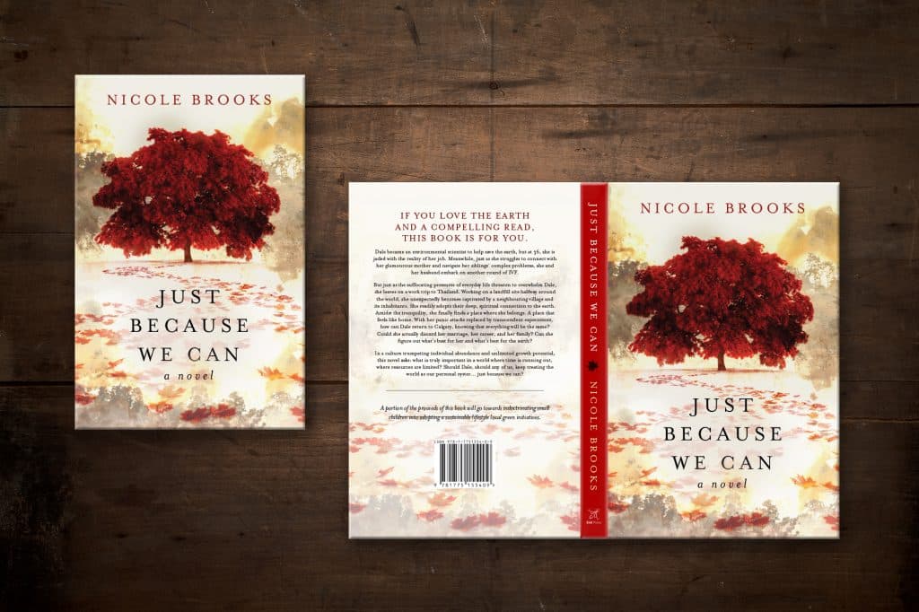
A book’s cover might be the first thing that catches a reader’s eye, but the spine is equally important—especially when your book is sitting on a shelf alongside dozens of others. For self-published authors, crafting an effective book spine is both a challenge and an opportunity to make a lasting impression. In this post, we will walk you through everything you need to know about designing the perfect book spine.
Before we delve into the nitty-gritty, let’s take a quick look at what this post will cover.
Table of contents
So, what exactly goes on the spine of a book? Let’s find out.
What Goes on a Book Spine?
Here are the fundamental elements that make up a book spine:
- Book Title: Should be legible and the same as the front cover.
- Author Name: Your name, as you’d like it to appear.
- Publisher Logo/Name (Optional): If applicable.
- Genre or Category (Optional): Useful for reader identification.
- Series Number (if applicable)
- Other Design Elements: Graphics, colors, or textures that fit your book’s aesthetic.

Now that you’re familiar with the essential components of a book spine, let’s delve into the best practices for putting it all together.
Best Practices for Book Spine Design
Font & Typography
- Readability: Choose fonts that are easy to read from a distance, and consider changing the color of the title text to improve contrast with the background.
- Font and Typeface Consistency: Stick with one or two types of fonts that are in harmony with your book cover.
- Capitalization Rules: Consistency is key. Stick to one style, whether it’s all caps, title case, or sentence case.
- Sequence Indicators: For books that are part of a series, include an easily discernible number or symbol that helps to identify its place in the sequence.

Imagery and Colors
- Publisher/Author Logos: If you or your publishing house have recognizable logos, subtly integrate them into the spine for brand continuity.
- Matching the Cover: Ensure that the color palette and design elements mirror those on the cover for a unified look.
- Unique Elements: Introduce a small yet attention-grabbing design feature that doesn’t compromise the readability but adds a flair of originality to your spine.
- Alignment and Spacing: Make sure all elements are centered and evenly spaced. This is critical for a polished, professional look.

Avoiding mistakes is just as important as following best practices. Here are some pitfalls to steer clear of.
Common Mistakes to Avoid
- Overcrowding with too many elements, multiple fonts, or excessive decorative elements and sacrificing legibility.
- Making poor color choices that lead to low contrast and readability, or have unintended cultural implications.
- Failing to maintain design consistency between the spine, cover, and other volumes in a series.
- Preparing the spine design before the interior has been fully edited and formatted, risking the need for resizing due to changes in page count.
- Skipping the prototyping and proofreading steps, leading to errors or unexpected design issues. Double check your digital mockups and order a proof copy to hold in your hands and review!
An often-overlooked aspect of spine design is its width. Here’s how to accurately determine it.
Determining Your Book’s Spine Width
The width of a book spine is determined by the number of pages in the book and the type of paper used for printing. It’s important to note that most printers have a page minimum for spine printing; if your book doesn’t meet this requirement, text may not be an option for the spine.The number of pages needs to be determined from the PDF (here’s how to do that) that has been edited and formatted for print. Publishers and printers often provide a spine width calculator or a formula to help authors determine this crucial dimension (here is KDP’s cover calculator and IngramSpark’s template creator). Always confirm the final page count and paper type before finalizing your spine design otherwise it will result in an error when you upload your print-ready PDF to the printer.
To sum it all up, let’s take a look at the key takeaways.
Conclusion
Crafting the perfect book spine is more than a design afterthought—it’s a critical piece in presenting your work and drawing readers in. Keep your design clean, consistent, and in line with your book’s overall theme. By following best practices and avoiding common pitfalls, you’re not just binding pages; you’re creating a complete package that readers won’t want to overlook. Make your spine as compelling as the story it holds.
For further reading and resources on related to print book cover design, check out the following.

