Sci-Fi book cover designs are constantly evolving. Science Fiction has given us countless worlds, big and small.
Legions of space heroes dressed in astronaut white explore blue, green, and red planets. Rebel armies wear nature-inspired hues and dream of a better world for future generations to inherit. Big Brother orders society to conform so we get matching uniforms and careers based on singular personality traits. And don’t forget about the villains! In the future, bad guys wear black—unless they’re robots, in which case, chrome is acceptable.
While some tropes have remained, other aspects of sci-fi are adapting to fit the needs of a broader target audience in a new technological age. One of the best ways to track these changes is by looking at sci-fi book cover designs.
Sci-Fi Book Cover Designs Through the Ages
Science Fiction has skyrocketed in popularity in the last 100 years. Here we’ll break down some significant shifts in the genre before looking at specific examples.
Early to mid-1900s Sci-Fi Book Cover Designs
‘60s and ‘70s Sci-Fi Book Cover Designs
While the United States and Russia were racing to the moon, writers and artists wondered what would come next. What existed beyond the moon? Transformative authors like Arthur C. Clarke and Ray Bradbury speculated about what life on a spaceship might be like. Or how interacting with the galaxy at large could change our idea of humanity. But not everything was doom and gloom. The ‘70s brought disco, Atari, vivid color schemes, and all sorts of wacky aliens. Maybe the future isn’t so scary after all?
’80s and ‘90s Sci-Fi Book Cover Designs
One of science fiction’s most pervading themes is a fear of the unknown. In the ‘80s, people began to fear for the future of our little blue planet. Earth was under attack from all directions: environmental disasters, totalitarian regimes, anarchy, deadly plagues, and monstrous creatures of all shapes and sizes. This time period stressed a dark, dank aesthetic and emphasized the dangers of technology. Stories like Blade Runner and The Matrix made trenchcoats and standing in the rain look cool.
Early 2000s Sci-Fi Book Cover Designs
Science fiction continued to predict how increasing technology would change our lives for the better or worse. Philip K. Dick’s short story “Minority Report” became an award-winning film about psychic technology and time travel. Innovations in various medical fields led to discussions about genetic mutations, designer babies, and superheroes. It wasn’t long before Marvel Comics launched Phase 1 of their hugely successful superpowered movie series in 2008.
Modern Sci-Fi Book Cover Designs
Today, science fiction has endless opportunities to discuss space, time travel, advanced technology, and so much more. It’s difficult to guess what future societies will say about science fiction from the 2010s and 2020s. But we can make some inferences based on current trends. Big government, universal rights, immigration, and of course, COVID-19, have all sparked debate. Authors like N.K. Jemisin, Rebecca Roanhorse, and Ted Chiang have dominated the Hugo awards for the last several years. If you want to understand the future of science fiction pay attention to who is talking.
Like fantasy or romance novels, science fiction book covers are going to be tailor-made for specific subcategories of the genre, including:
● Space Travel Science Fiction
● Apocalypse and Dystopian Fiction
● Time Travel Science Fiction and Pararell Words
● Artificial Intelligence Science Fiction
● Mutants and Monsters Science Fiction
This isn’t meant to be an all-encompassing list, but it can help you decide how you could design or market your own sci-fi novel. If you’d like help designing your book cover, or want to explore your options, Ebook Launch’s collection of sci-fi book covers is a great place to start.
Space Travel
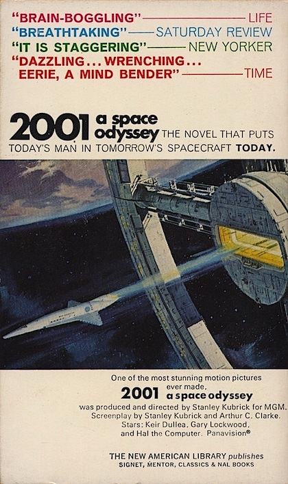
It came from Space! Epic sagas like Star Wars, Startrek, and The Foundation Series by Issac Asimov have colonized readers’ minds since the mid-1900s. Stellar sci-fi book cover designs should offer readers a glimpse into your futuristic world. It might be an alien landscape like the cover of Dune, a futuristic spaceship like 2001: A Space Oddessy, or a culturally important scene. The choice is yours.
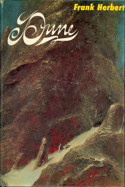
1. Dune by Frank Herbert
Herbert published his science fiction space odyssey in the summer of 1965. John Schoenherr created this dark and treacherous cover design. And Analog featured it on the front cover of their Magazine too.
Schoenherr’s cover design implies a quest narrative through a strange and dangerous world. Scale plays an important role here as the daunting landscape dwarfs the characters on the page.
2. 2001: A Space Odyessy by Arthur C. Clarke
Director Stanley Kubrick teamed up with Arthur C. Clarke to create this science-fiction thriller. The novel was written concurrently with the film and based on Clarke’s award-winning short stories published in the ’50s.
This minimalist cover design by Robert McCall looks like a page pulled out of a newspaper. It is also easy to read, making the novel look more approachable, which can be important for epic sagas like 2001.

3. The Hitch-Hikers Guide To The Galaxy by Douglas Adams
A group of English artists, including Hipgnosis and Ian Wright, created this vintage sci-fi cover design. When this radio series turned best-selling science fiction novel hit bookshelves in 1979, it quickly became a best seller. Vibrant rainbow static mimics the static on a TV screen. The bright color pallet speaks to the light-hearted nature of the book and helps set expectations for readers.
4. Red Mars by Kim Stanley Robinson
Red Mars, initially published in 1993, takes place in 2026. This story explains the colonization of mars over several decades.
Don Dixon created several cover designs for the Red Mars series,
including this one. The font is bold and authoritative. Sci-fi novels often choose strong typographies to assert confidence and boost readability. The astronaut images lining the page help readers understand that this is a story about people and their adventures–not a science textbook.


5. The Damsel by David Dixon
Ebook Launch had the honor of designing this vintage-inspired sci-fi book cover for Dixon in 2020.
The typography is reminiscent of comic books, and the imagery is minimal. Having a human element—like the protagonist’s painted nails pulling the trigger—leads us to believe this is a soft science novel. Soft science puts futuristic technology in a story’s background so that characters can really shine.
Apocalypse / Dystopia
The end is near, or worse; it’s already here. Apocalypse books walk the line between horror and science fiction. Meanwhile, dystopias are often more politically driven. Either way, this subgenre of science fiction isn’t afraid to delve into the darker elements of humanity. Cover designs in this subgenre use more symbolic pictures, harsh color contrasts, and fractured imagery.
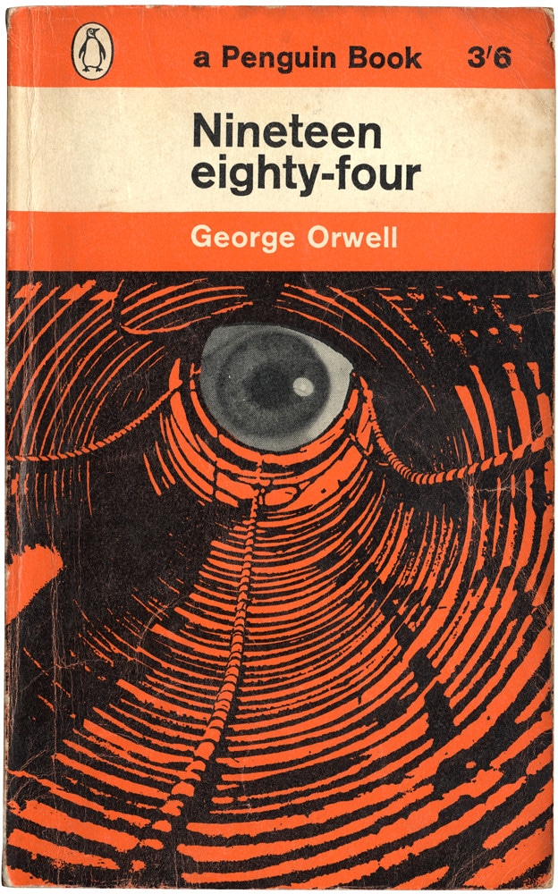
6. Nineteen Eighty-Four by George Orwell
George Orwell is Penguin’s all-time bestselling author. He published his classic sci-fi novel, Nineteen eighty-four, in 1954. Germona Facetti later agreed to create this “eye-conic” cover design for the book.
Everything leads back to the all-seeing eye. Since Penguin was writing the check, they likely chose the font and color scheme to represent their brand. Still, the unique tunnel imagery gives readers plenty to chew on. It signals internal confusion, or in Wilson’s case, his eventual brainwashing.

7. The Stand by Stephen King
This Stephen King novel was officially released as a complete work in 1978, but pieces of it were published as early as 1969. King admitted that he wanted The Stand to be a modern American version of The Lord of the Rings. John Cayea created this timeless sci-fi cover design. The background gently fades from one hue to the next, keeping readers focused on the symbolic images on the center of the page.
8. Burning World by J.G. Ballard
J.G. Ballard is one of the most well-known apocalypse writers. He wrote The Burning World in 1965, and Richard M. Powers created this fiery cover design later that year.
This vintage cover design is equal parts bright and disturbing. Towns are being destroyed in the valley as figures scramble to the top of a suspiciously alien-looking rock. Yellow and orange often signal change, energy, and rebirth. This cover offers more questions than answers but in a good way. After all, some folks just want to watch the world burn.

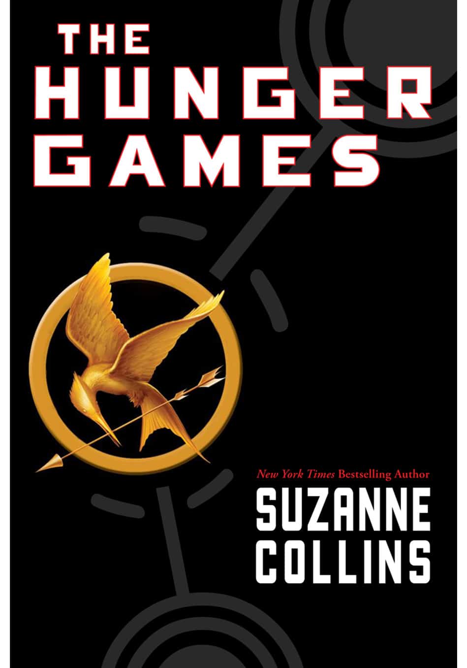
9. The Hunger Games by Suzanne Collins
It would be hard to talk about dystopias without mentioning the 2008 bestseller, The Hunger Games. Tim O’Brien created this striking cover design for copies sold in the United States.
Sometimes the perfect cover imagery is found within the pages of your book. O’Brien admitted that he drew the Mockingjay in several different positions, trying to find the perfect fit. “It is not just a picture of a bird.” He writes. The Mockingjay is a symbol of the main character, Katniss, who is tough and beautiful at the same time.
10. Wake Me After The Apocalypse by Jordan Rivet
Rocketing forward to modern sci-fi book cover designs, Ebook Launch created this stunning dust jacket in 2018. Wake Me After The Apocalypse is also free on Kindle Unlimited. Newer books in this genre focus on moving forward and celebrating survivors. This is one of our favorite cover designs because it brings hope to a devastated world. There is beauty at every stage of creation and destruction.

Time Travel and Parallel Worlds
Who’s time is it anyway? All bets are off once you start playing with time travel fiction and alternate worlds. And yet, that’s what makes this subgenre of science fiction so intriguing. Writers get to imagine: What if? Then you add a couple of decades of technological advancement—or a dash of magic—then you’re ready to hop in a DMC DeLorean and take off!
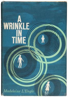
11. A Wrinkle in Time by Madeleine L’Engle
L’Engle’s classic time-twisting novel has been enjoyed by kids and adults alike since its release on New Year’s Day in 1962. Ellen Raskin created the original cover design. Today, first edition copies can cost upwards of $17,000!
This color scheme on this cover works incredibly well to convey a sense of mystery. The uneven blue background is like a fog that has trapped each character within their own spiral. TV shows like Pink Panther popularized this shadowy, minimalist design style.
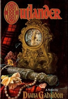
12. Outlander by Diana Gabaldon
Diana Gabaldon continues to make a name for herself in today’s sci-fi market. She got her first big break with the Outlander Series published in 1991 by Delacorte Press.
Most of the time, time travel novels feature cylindrical images such as a clock, timer, or even sundials paired with other visual hints. The flowers and red fabric give readers a hint of romance, while the dagger could symbolize a betrayal or danger. Think of your cover design like a metaphorical chest of secrets. What would yours include?
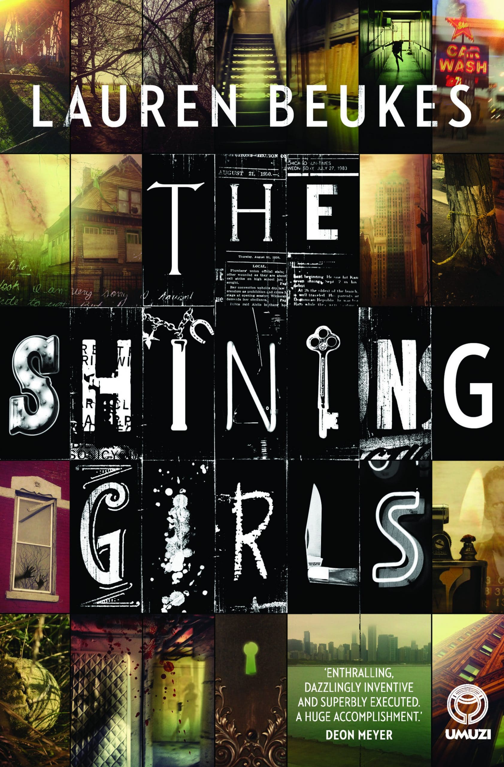
13. The Shining Girls by Lauren Beuke
The Shining Girls is time travel with a dark twist. What if a serial killer was behind the wheel? Joey Hi-Fi created this multifaceted sci-fi book cover design in 2013. She spoke about her creative process in an interview.
Vintage ‘90s book covers inspired this early 2010s design with dark, gritty surrealism and photography. Fractured cover designs like this one can convey many different points of view in a story. They prepare readers for nontraditional jumps in the narrative. As well as extensive flashforwards or flashbacks.
14. Trivium by Amber Nguyen
Nguyen’s Trivium Trilogy focuses on one central question: what if you could know your future? Ebook Launch created this soul-seeking sci-fi book cover design in 2018.
Using imagery found in the natural world creates powerful designs. Water symbolizes inner peace as well as the fear of the unknown. Meanwhile, the fonts are delicate and lightly shaded, giving this design an ethereal, timeless presence on the page.

Artificial Intelligence
People have a lot of opinions about artificial intelligence, also called AI. In a study from 2017, 70% of people said they were nervous about robots replacing humans at work, in cars, or at the doctor’s office. Will artificial intelligence outsmart human intelligence one day? The truth is, we aren’t sure. Science fiction allows us to explore the fears and expectations that have stayed with people for generations.

15. I, Robot By Isaac Asimov
Asimov is one of the godfathers of science fiction. His groundbreaking novel I, Robot, introduced the world to artificial intelligence in 1950.
Edd Cartier was the mastermind behind this old-school ‘50s sci-fi cover design. The heavy shades of red induce a sense of dread, and the robot’s empty gaze hidden behind his heavy armor offers little comfort. Around this time, people started asking, what happens if our machines turn on us?
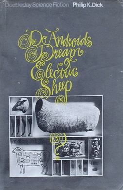
16. Do Androids Dream of Electric Sheep by Phillp K. Dick
This book cover is reminiscent of the Twilight Zone, with its curvy font layered on top of abstract grayscale imagery. Doubleday published the book in 1968.
This cover design is the sum of all its parts. Anytime we’re taking something apart, we’re experimenting. Searching for the monster hidden underneath the gears, or in some cases, under our own skin.
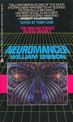
17. Neuromancer by William Gibson
The Neuromancer was inspired by the great dystopias that came
before it. Characters are looking at the robotics within the human mind and attempting to make some changes.
James Warhola created this classic ‘80s sci-fi cover design in 1984. He pulled inspiration from popular video games like Tetris and Pac-Man. Neon colors on a pitch-black background make this cover quick and easy to decipher.
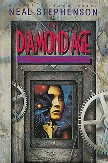
18. The Diamond Age
Flash forward to 1995. Artificial intelligence novels are similar to their ’80s companions, but a tad darker, more isolating, oh, and it’s still raining.
Human imagery plays a central role in this design created by Bruce Jensen, but notice how the human face is only given a fraction of the page. This symbolizes that people are being broken down into their
base components. Basically, they are locked away in vaults or prisons.

19. Dawn of Legaia By A.C. Hachem
Published in 2017 and cover designed by Ebook Launch, the future is
blossoming open with Dawn of Legaia. Modern sci-fi has a more
balanced opinion about Artificial Intelligence than its predecessors.
We need technological advancements, but at what cost?
Balance is a key to a great book cover. The way the text is shaded and interlaced with the central flower gives this design momentum.
Robotics in the background let us know this is a sci-fi novel, but the
the flower is an excellent human touch.
Mutants and Monsters
What do you do when your kid has antlers like in the hit series Sweet Tooth? Or when Godzilla rises out of the sea and smashes that cute little boardwalk town with the best ice cream by the beach? Since the dawn of the dinosaurs, society has been fascinated with monsters and mutants. It ties back to science fiction’s central idea of exploring the unknown.
20. Jaws by Peter Benchley
If you’ve ever traveled to the beach, you’ve likely imagined Jaws
swimming somewhere out in the deep blue sea. Benchley’s widely
successful novel came out in 1974. Paul Bacon created this famous sci-fi book cover design that continues to lurk in the mind of beachgoers. It’s a simple design, but no one can deny its effectiveness or longevity.

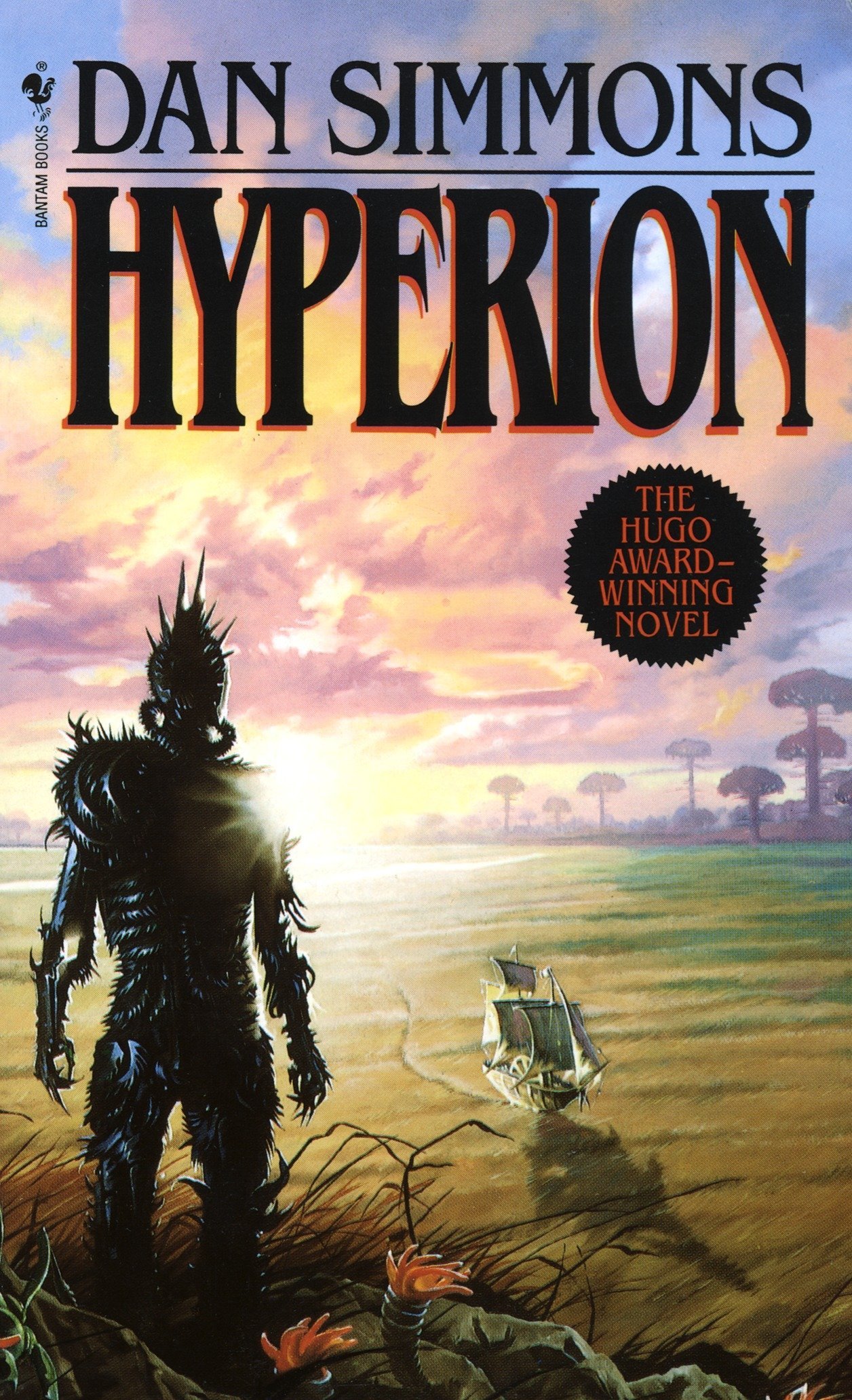
21. Hyperion by Dan Simmons
Hyperion, published in 1989, is a space opera with an unforgettable
monster called the Shrike. He’s like Vlad the Impaler—but alien.
Gary Ruddell created this fantasy-inspired cover design. It’s stylized like many ‘80s cover designs were at the time, with a large, bolded
font at the top of the page and vivid color imagery throughout. This cover art signals that an intergalactic quest is at hand, and the stakes
are high.
22. The Lost World by Michael Crichton
The Lost World was labeled a “techno-thriller” when it first hit the market in 1995. Much like Jaws, the dinosaurs found at Jurrasic Park continue to live in the minds of readers and film lovers. And on Twitter!
Black and white can be a risky move, but it paid off for designer Chip Kidd. The Lost World is a dense read. It’s more suited for adult readers than kids or teens. Keeping this in mind, a black and white color palette makes a book about dinosaurs feel sophisticated. Like it is worthy of an adult reader’s time and expectations.


23. Halfskin by Tony Bertauski
Another “technothiller” that readers are excited about is Bertauski’s Halfskin. This book was published in 2012 with a cover by EbookLaunch. The story combines new technology with genetic mutations to create endless possibilities. But at what cost? Well, the answer isn’t all black and white—careful use of color creates layers between what’s human and what’s not. The font and background are both a little grainy, empathizing that something isn’t as clear-cut as people might assume.
In Summary
Writers, artists, inventors: we are the all-powerful idea creators. We put our wants, needs, and dreams into things people can understand and hopefully relate to. Studying fiction from the past can tell us what’s to come in the future. There are still new planets to explore, space diners to visit, and aliens—who might decide they don’t want to eat us after all. The important thing is getting your story out to the world.
If you’ve written a sci-fi novel and are struggling to develop an epic cover design, feel free to bookmark this page as inspiration. It may interest you to take a peek at our premade sci fi book covers to see if there are any there that fit your book. You can also reach out to our design team if you’re looking for a custom book cover design to fit your book!

